Packaging & PrintFMCG & Food
Peanut butter tubs that make every flavour unmistakable.
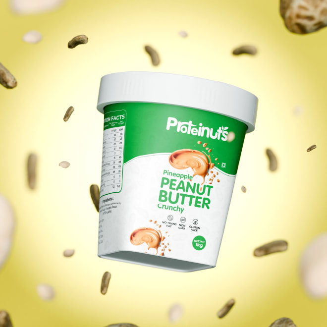
Proteinuts peanut butter tub surrounded by floating peanuts
Overview
Proteinuts makes crunchy natural peanut butter in flavours like Pineapple and Dark Chocolate. We designed its logotype, the tub label system, launch visuals and a product film.
The brief
Peanut butter shelves are crowded with near-identical jars, and shoppers decide in seconds. Proteinuts needed a pack that stands out, signals 'natural and high-protein' without a lecture, and makes each flavour instantly distinct.
Read moreShow less
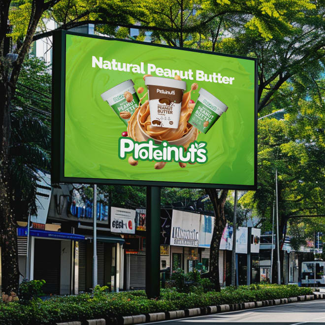
The same look had to work beyond the shelf: on a delivery truck, a roadside billboard and a phone screen once the brand began selling online.
The work
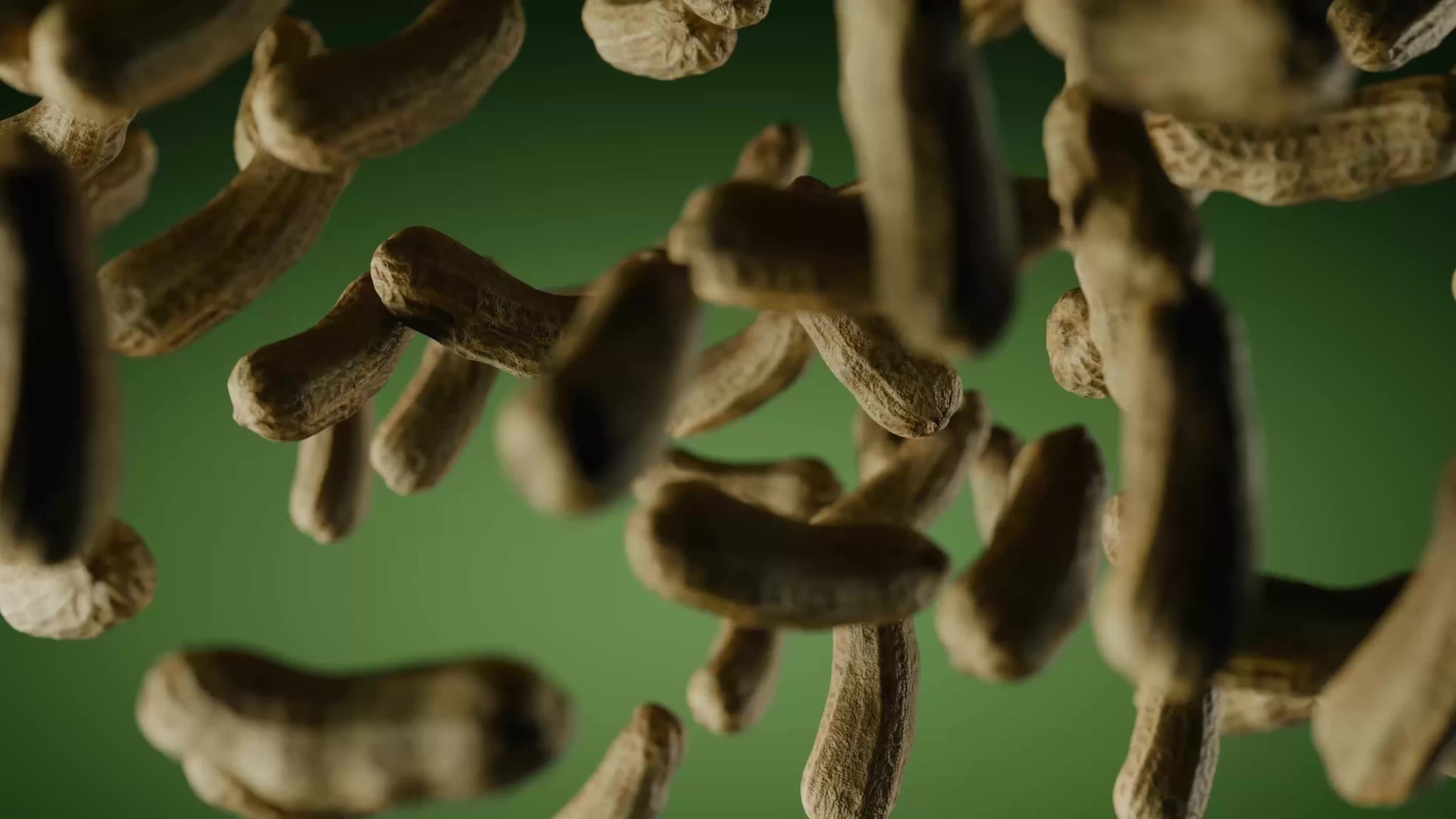
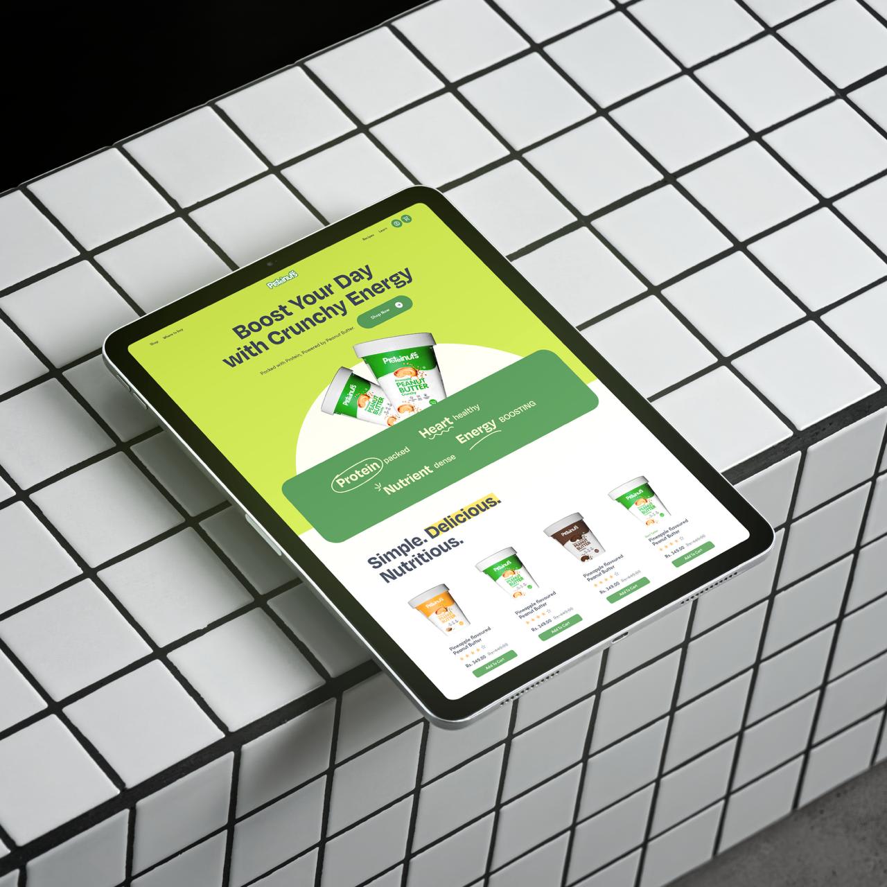
Frames from our work for Proteinuts. Mockups show the designs in use.
How we approached it
A friendly logotype
A rounded, bouncy green wordmark with a leaf on the final letter. It feels approachable, energetic and clearly natural.
Colour-coded flavours
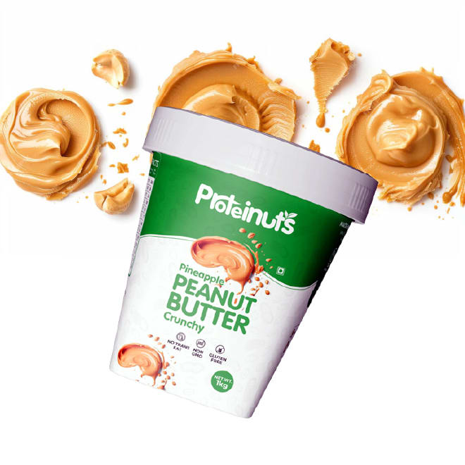
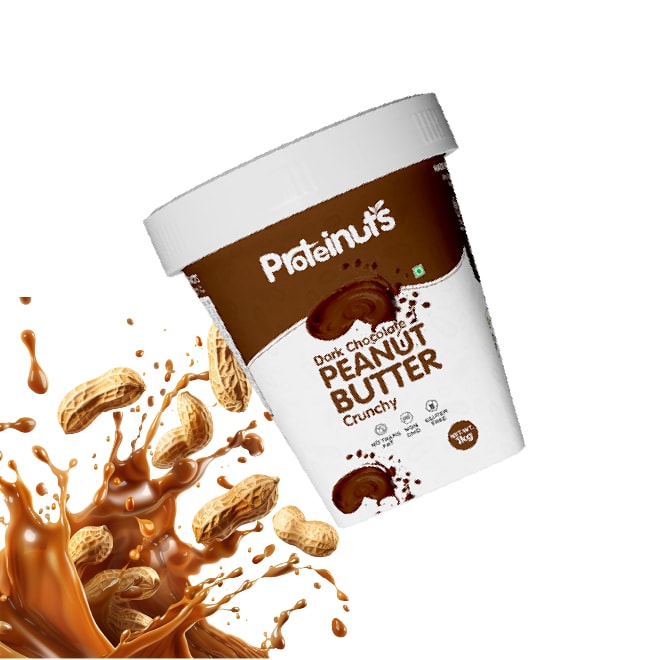
A white tub with a brand-green band for Pineapple Crunchy and a rich brown band for Dark Chocolate, so flavour reads from across the aisle.
Appetite in every render
Hero renders with peanut-butter splashes, floating peanuts and fruit that show texture and flavour before the lid comes off.
Brand on the move
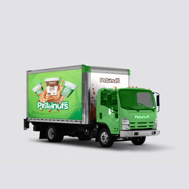
The system rolled out to truck livery, a 'Natural Peanut Butter' billboard and a slow-motion peanut film.
The outcome
A launch-ready packaging and brand system covering the logotype, flavour-coded tubs, product renders, truck livery, billboard and product film. It gives Proteinuts one consistent look from shelf to street.

Start a project
Want work like this?
Tell us what you're building. A strategist replies within one working day, and after a short call the plan, the timeline and the quote follow in writing within 48 hours.
Every rupee you spend with us has to earn its keep.