BrandingRetail & E-commerce
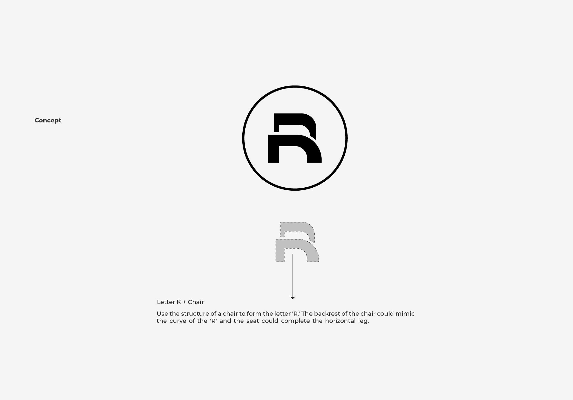
A seating brand whose R is built from a chair.
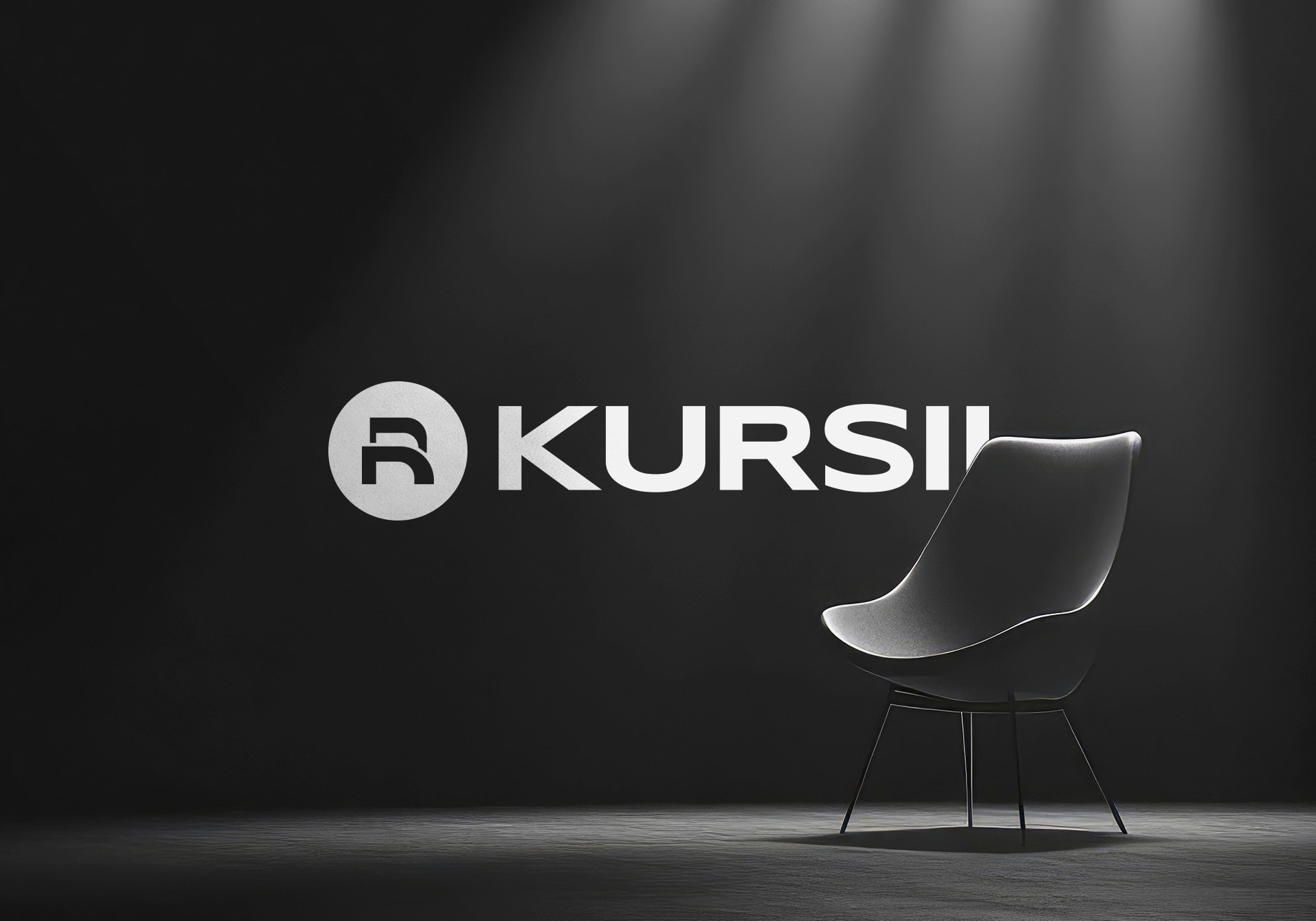
Kursii logo lit on a dark stage beside a designer chair
Overview
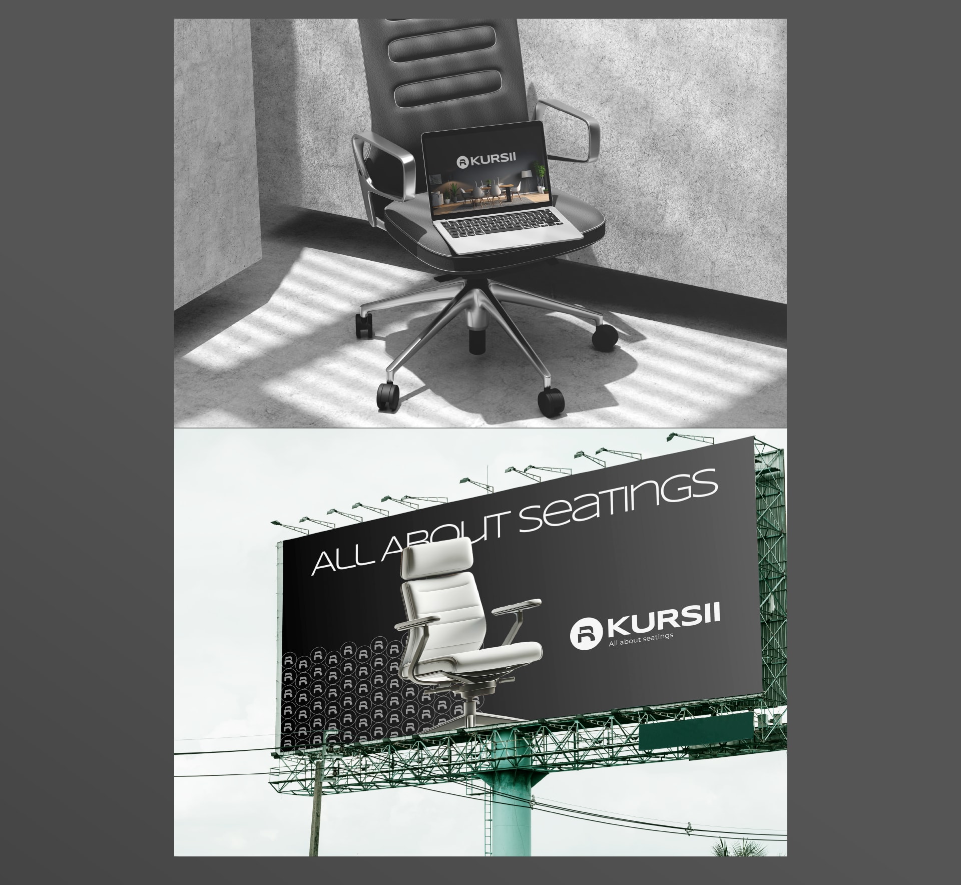
Kursii sells office and home seating. We built its identity around one idea, a chair drawn as the letter R, and mocked it up everywhere the brand would appear, from a roadside billboard to a delivery truck.
The brief
Kursii was entering a category crowded with furniture dealers whose names rarely become brands. The brief was an identity that reads as design-led from day one and says 'seating' before anyone reads a word.
Read moreShow less
It also had to hold up at every size, from a hoarding and a truck panel to a business card and an app icon, and stay simple and affordable to reproduce across showrooms and print runs.
The work
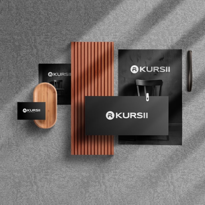
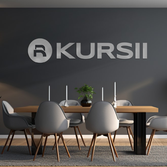
Frames from our work for Kursii. Mockups show the designs in use.
How we approached it
A chair in the letter
The backrest forms the bowl of the R and the seat completes its leg. The result is a monogram that is a chair and a letter at once, set in a circle for stamps and icons.
Monochrome by design
A black, white and graphite palette that lets each chair's upholstery carry the colour and reproduces cleanly on any material.
Pattern and scale
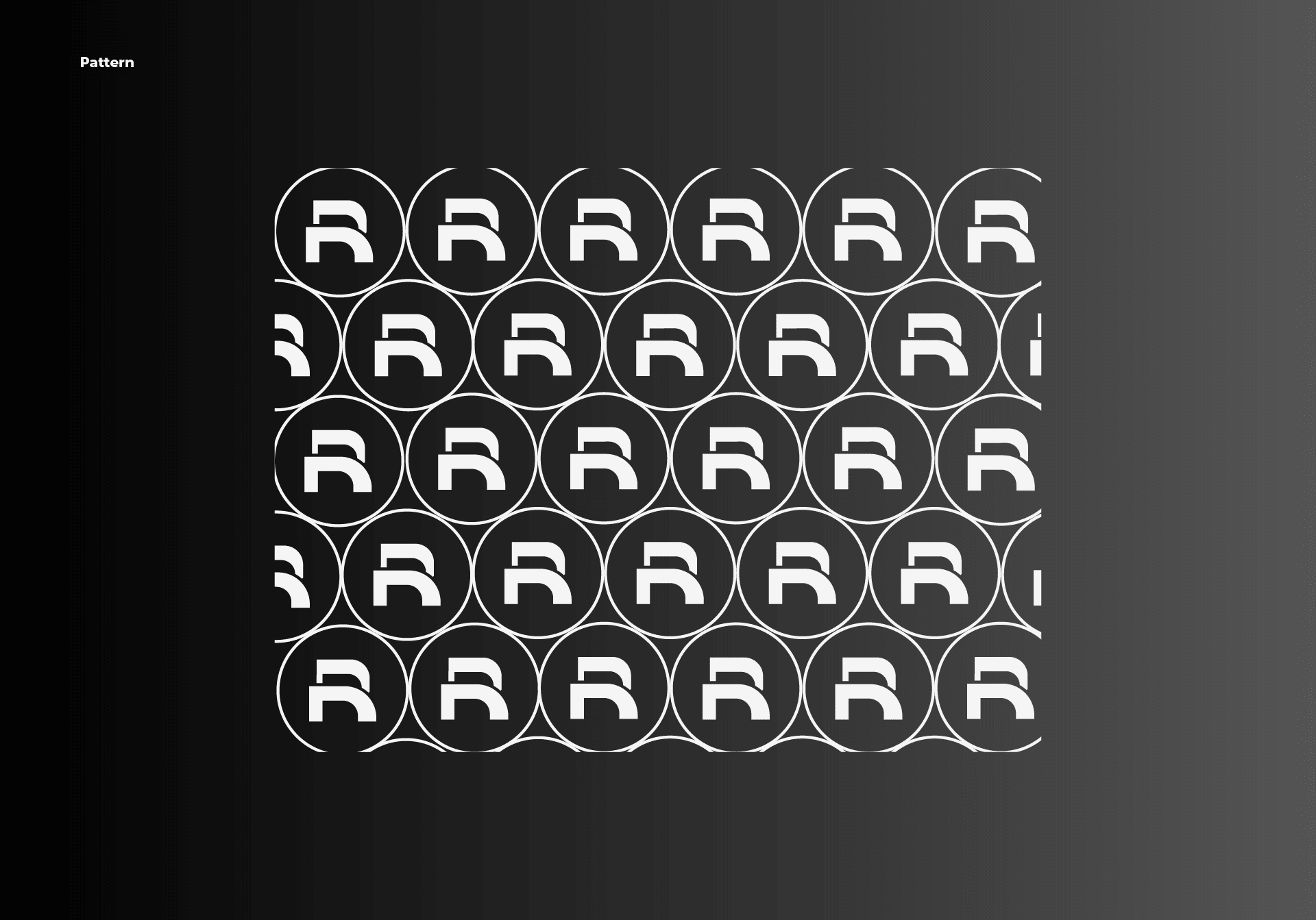
The monogram repeats into a pattern for packaging, uniforms and showroom walls, while the wide wordmark stretches across billboards and truck sides.
Rules for every surface
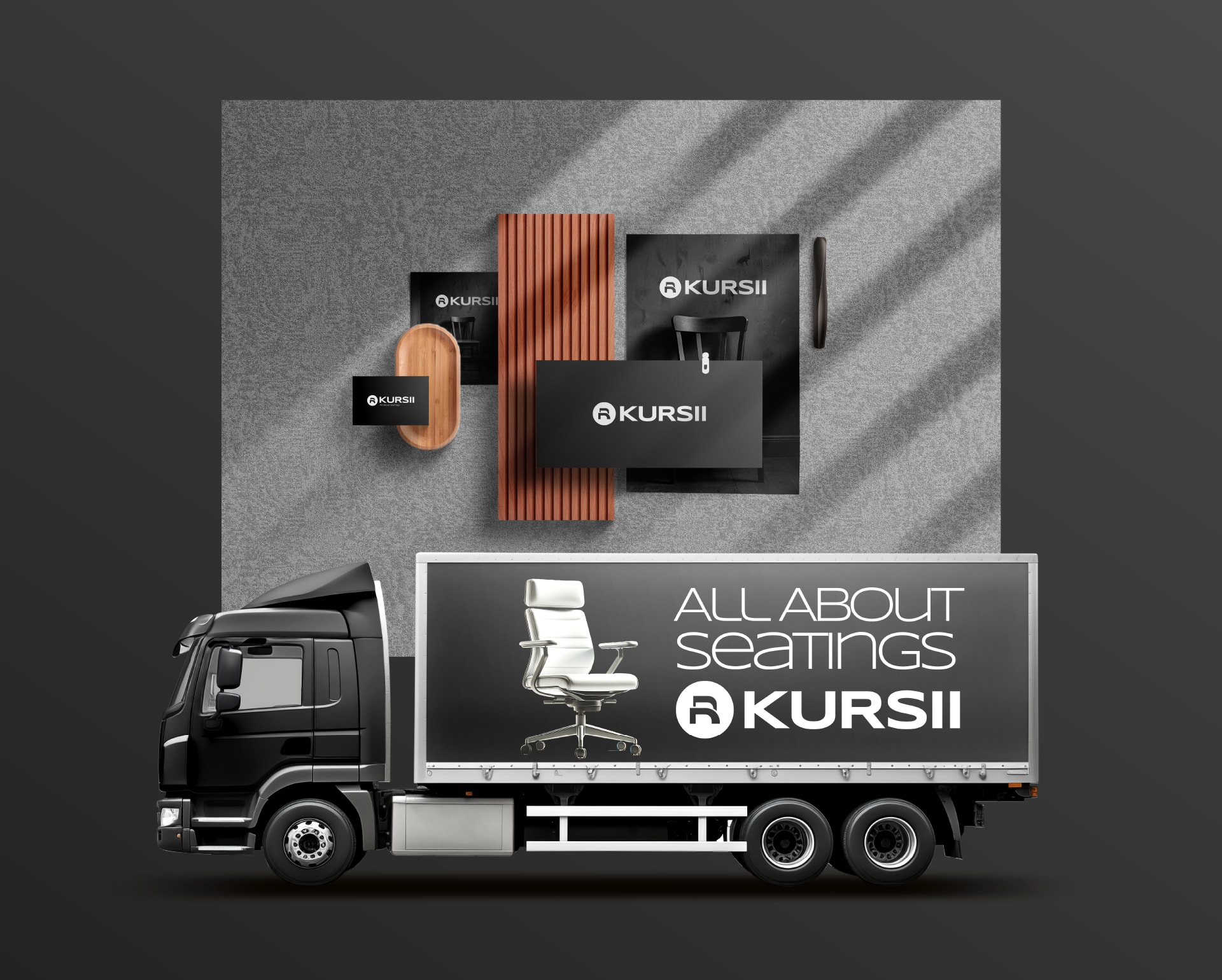
Lockups for light and dark grounds, usage guidelines and applications across stationery, signage, fleet and web.
The outcome
A complete identity system that gives a new seating brand the presence of an established one: logo suite, monogram pattern, guidelines, and designs for a billboard, signage, fleet livery and stationery.

Start a project
Want work like this?
Tell us what you're building. A strategist replies within one working day, and after a short call the plan, the timeline and the quote follow in writing within 48 hours.
Every rupee you spend with us has to earn its keep.