Brand proposalStudy-abroad consultancy
WeltBrand proposal for a study-abroad consultancy
A proposed identity for a study-abroad brand, in which one letter, the T, carries the whole journey: plane, book and graduate.
A brand proposal: a creative direction we presented, not a launched brand.
- Kind
- Brand proposal
- Sector
- Study-abroad consultancy
The brief, as read from the proposal
What Welt needed
This is a proposal: a creative direction, not a launched brand. It has no written brief page, so the brief is read from its content. An international-education brand needed a mark that feels aspirational and global, yet trustworthy enough for students and their parents.
Read moreShow less
The proposal answers by showing the direction rather than stating a brief: study-abroad dreams, learning and a successful career ahead, in one symbol.
The idea
The world is your campus.
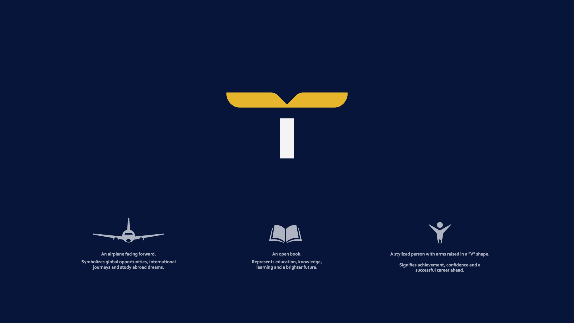
The direction is built on one line and one symbol. The final T of the WELT wordmark becomes a gold wing on a white stem.
Read moreShow less
In the proposal's own words it combines an aeroplane facing forward (global opportunities, international journeys and study-abroad dreams), an open book (knowledge, learning and a brighter future) and a figure with arms raised in a V (achievement, confidence and a successful career ahead). One glyph reads as leave, learn, arrive.

Logo
The proposed mark
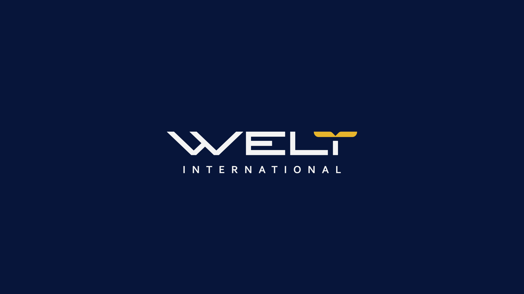
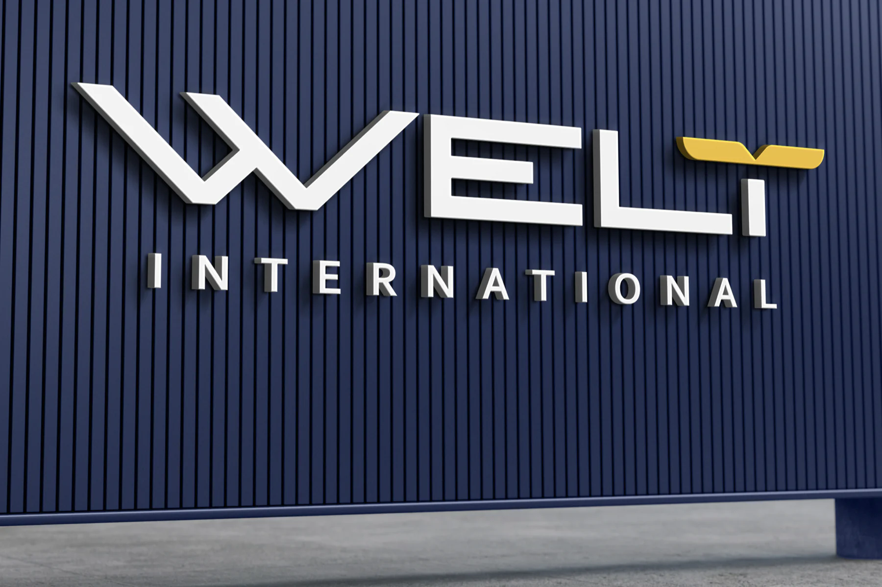
A custom, sharp-cornered wordmark. The W is a long, low, open chevron like a swept wing, and the letters have flat terminals and angled cuts. The T's crossbar becomes a gold wing, two flat blades meeting in a V notch: the only gold in the lockup, and a symbol that can stand alone.
Read moreShow less
INTERNATIONAL sits beneath in widely tracked capitals. The proposal shows the lockup reversed on navy, positive on a white card and small on photography. As a proposal, it doesn't set clear-space or minimum-size rules yet.

Colour
The palette, sampled from the proposal
The proposal states no colour values. These are sampled from flat areas of the artwork. Click or tap a colour to copy its hex.
Type
Three faces, one voice
Custom lettering
The WELT wordmark, drawn rather than typeset.
Corbel Bold
Supporting captions.
Wide-tracked capitals
The INTERNATIONAL descriptor and the campaign headline (outlined in the proposal).
The proposal ships its lettering as outlines, so only the caption face is named.
System
Everything around the logo
- The gold wing: the T's crossbar as a stand-alone symbol and the only warm accent.
- A three-icon symbol set (a forward-facing plane, an open book, a figure with arms raised in a V) in slate grey on navy, each with a one-line meaning.
- Flat deep-navy grounds with a single gold accent: restrained and editorial.
4 more from the bookShow less
- Wide letter-spacing on every secondary capital line.
- Photography: bright open sky, a low angle, a student celebrating with a degree scroll and a plane overhead (presentation imagery).
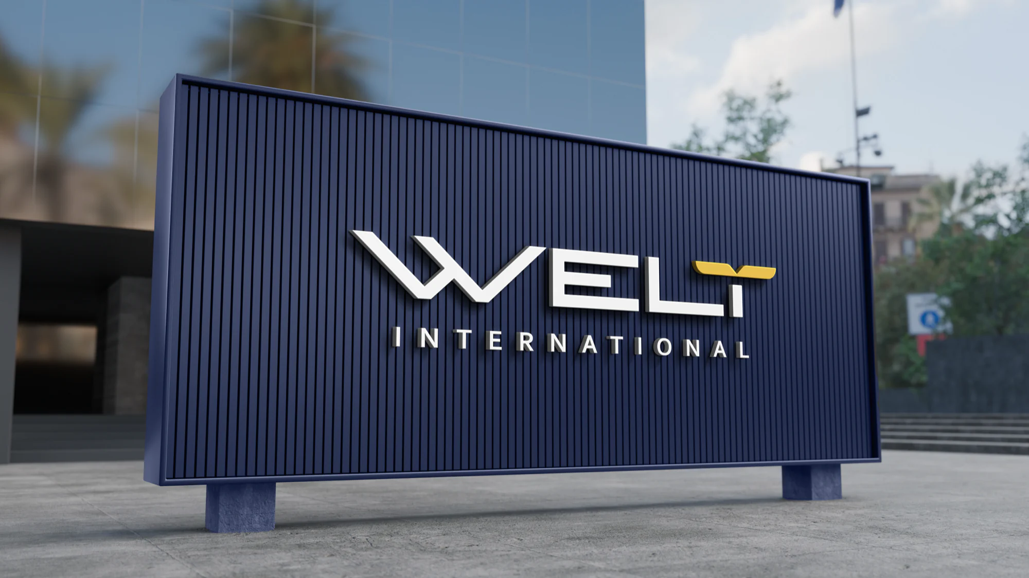
- Architectural material: fluted navy panels with dimensional white letters and a raised gold wing.
- Voice: short, declarative, second person. "The world is your campus."

Applications
How the direction would live
Presentation mockups from the proposal. Nothing here has been produced. Open any page to flip through the book.
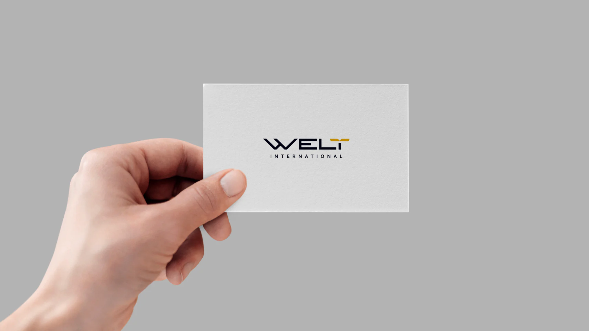
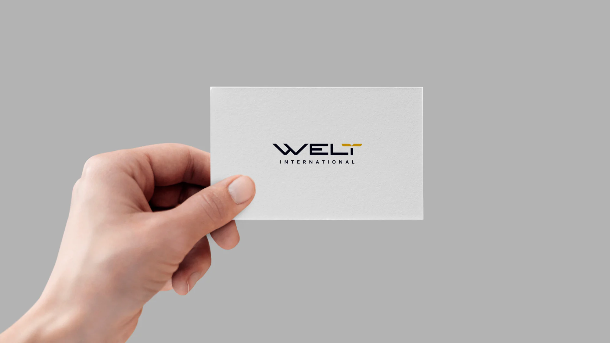
Proposal mockup: the positive lockup on an uncoated white card, navy letters and a gold wing. 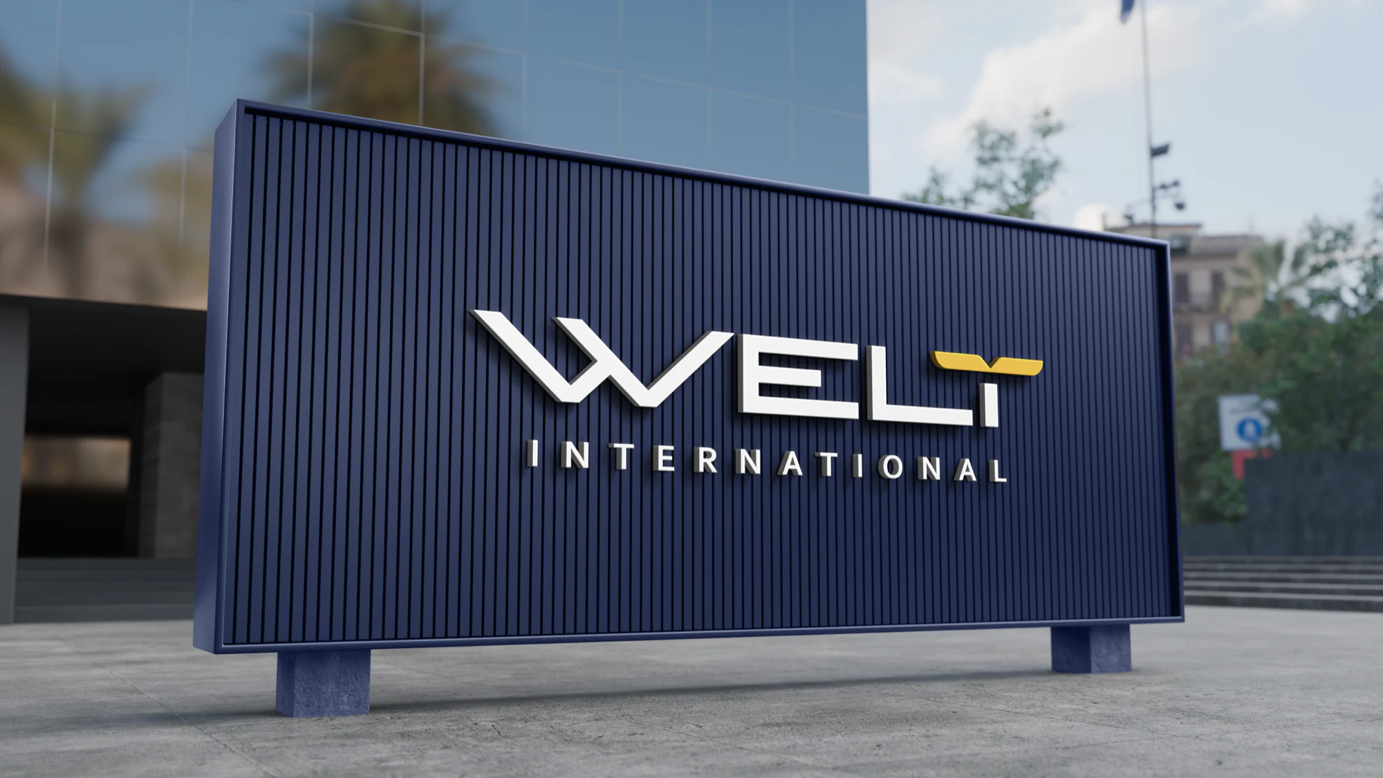
Proposal mockup: entrance signage with dimensional white letters on a fluted navy panel. 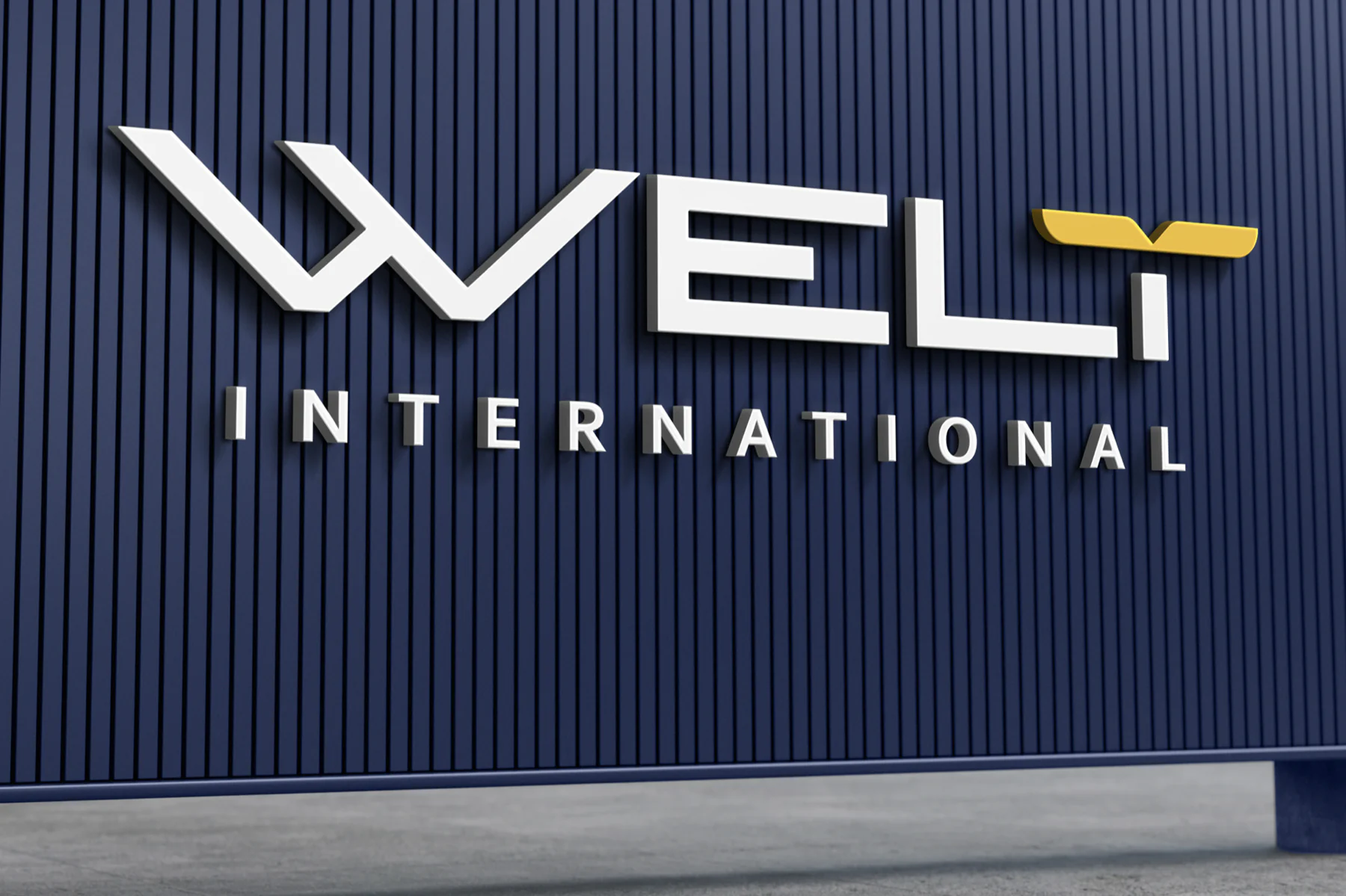
Up close, the gold wing is cut as its own raised piece, the one warm note on the navy.
Across the proposal: Campaign key visual · Business card · Entrance signage.
Credits
- Services on this proposal
- Branding
- Sector
- Study-abroad consultancy
- Status
- Proposal
Your brand next
Want a direction like this for your brand?
Tell us what you sell and who has to trust it. We'll come back with the direction, the system and every place it has to work, from the sign to the social feed.
Every rupee you spend with us has to earn its keep.