Brand identityEducation consultancyKochi and Calicut, Kerala
ClarixBrand identity for an education consultancy
A brand identity for a college-admissions and career-guidance consultancy: a purple wordmark that steps up like progress and opens like a book.
- Kind
- Brand identity
- Sector
- Education consultancy
- Location
- Kochi and Calicut, Kerala
The brief
What Clarix needed
Clarix Educational Consultancy works with students from every part of India. It supports college admissions and career planning end to end: it simplifies the process, helps families compare options and helps students make confident decisions.
Read moreShow less
It needed an identity that reads as clarity and progress, feels friendly to students and parents, and works as a wordmark, as an app icon and on everyday stationery.
The idea
Guiding Students With Clarity
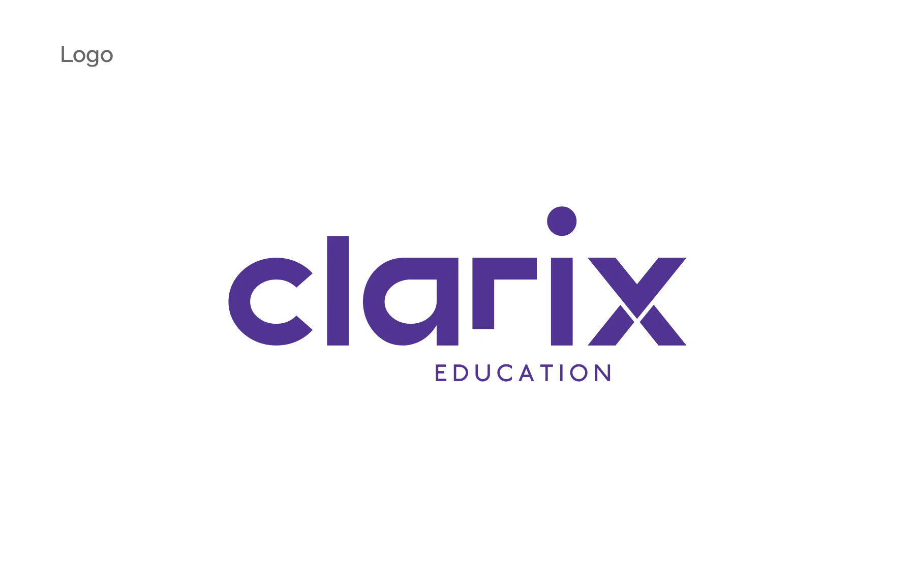
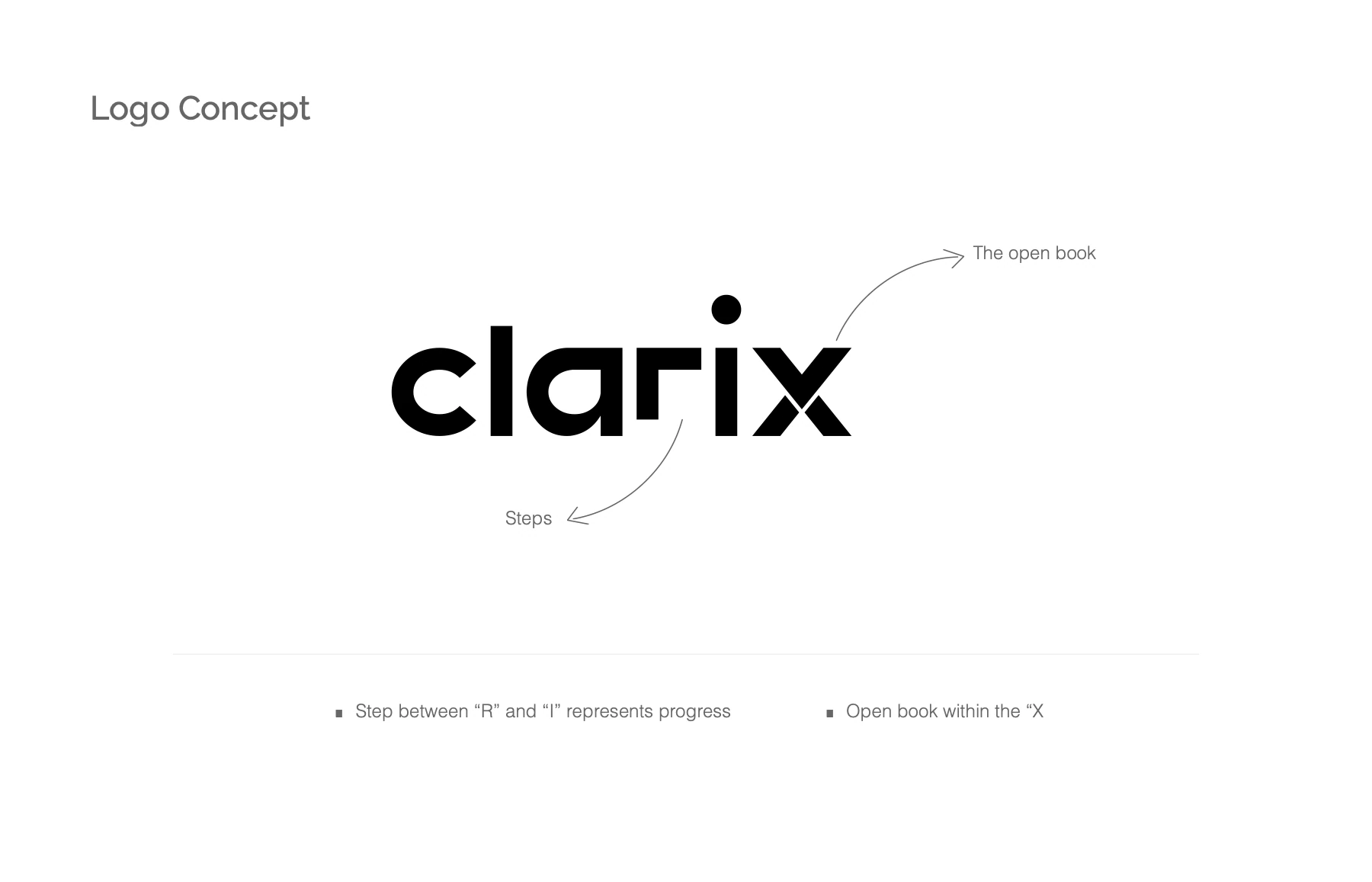
Clarity as a path forward. Two ideas are drawn into the name itself. A step between the "r" and the "i" stands for progress: the r's arm sits a level above the i. And an open book sits inside the "x", its split halves opening like pages.
Read moreShow less
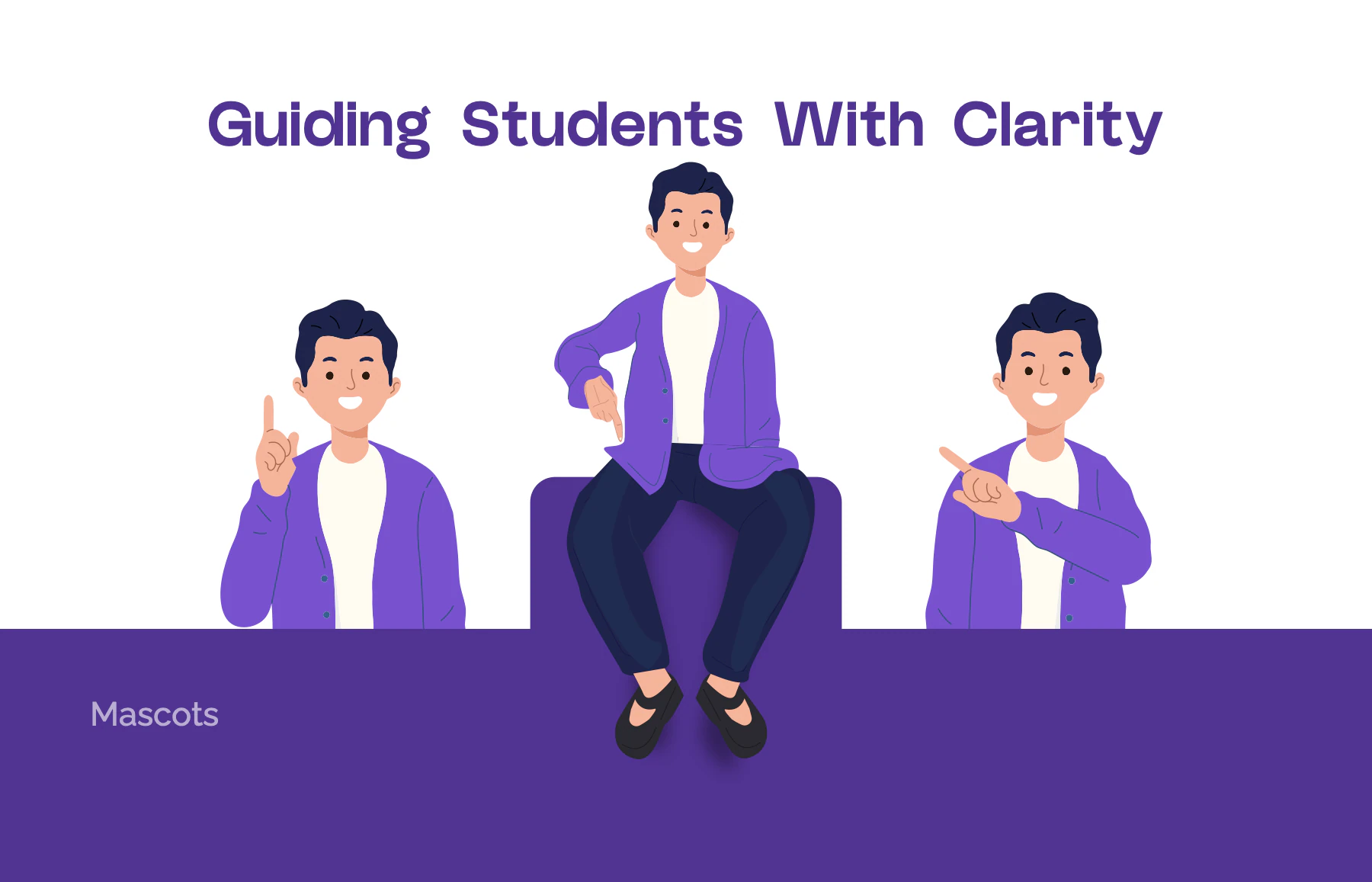
A friendly student-guide mascot and the line "Guiding Students With Clarity" carry the idea into a warm, student-first voice. The book states the goal plainly: "to guide every student towards success".
Logo
The mark
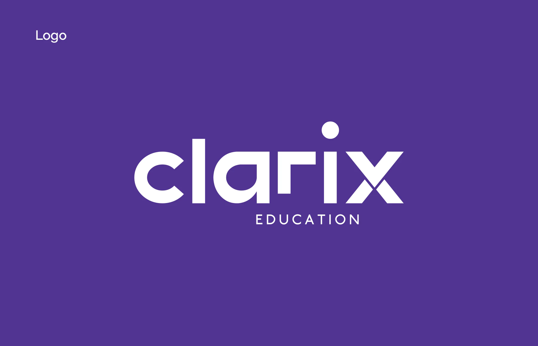
A lowercase geometric "clarix" built on the Ronta logo font, with EDUCATION letterspaced under the right half of the word. The i-dot is a full circle, the "r" is cut short so its arm steps above the "i", and the "x" splits into an open book.
Read moreShow less
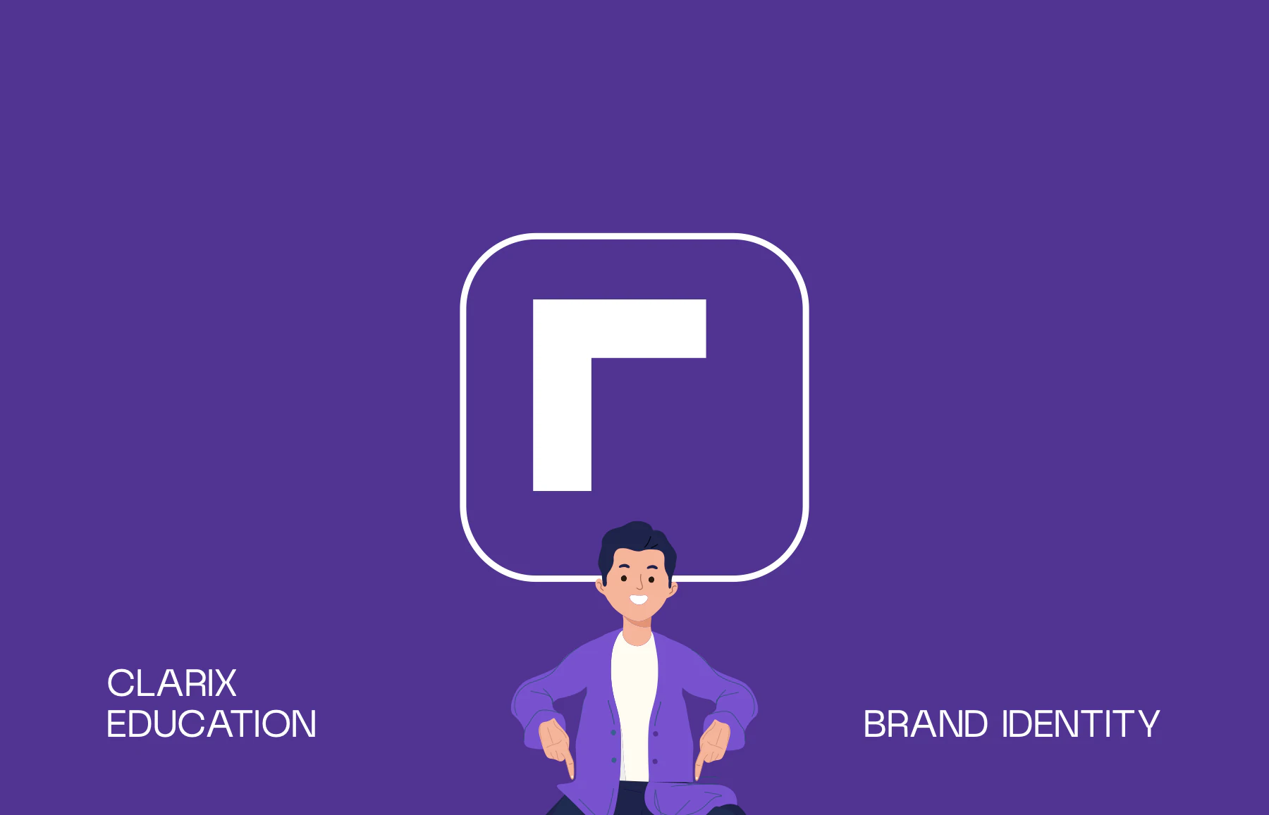
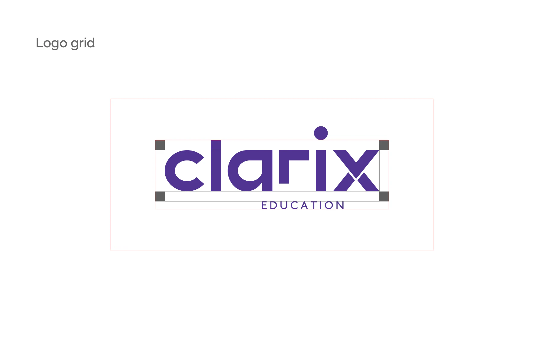
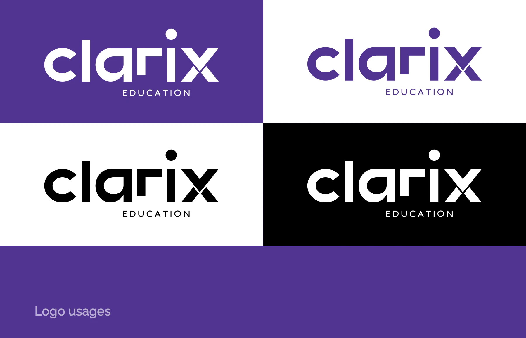
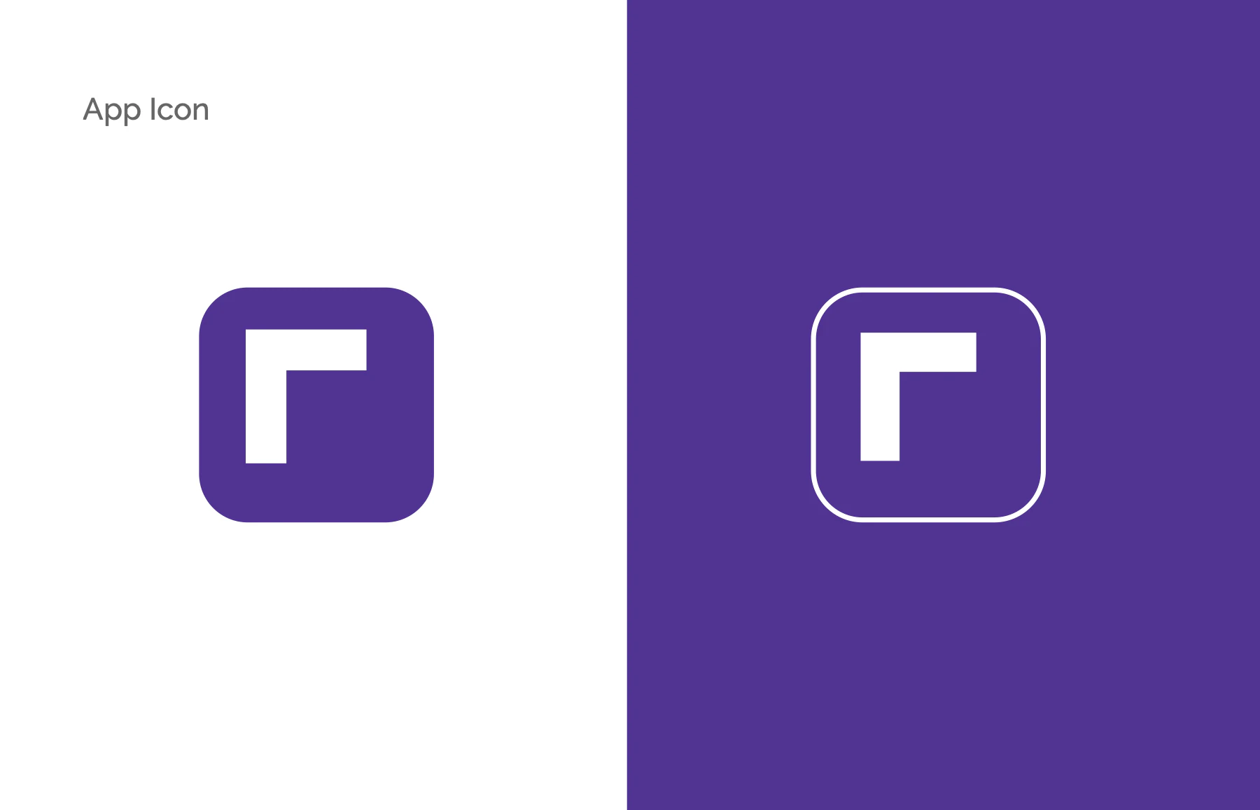
The stand-alone icon takes the stepped "r" corner, an inverted L, and frames it in a rounded square: a solid purple tile or a white outline on purple. The logo grid boxes the word on its x-height, with square corner modules setting the clear space. Four colourways are approved: purple on white, white on purple, black on white and white on black.
Colour
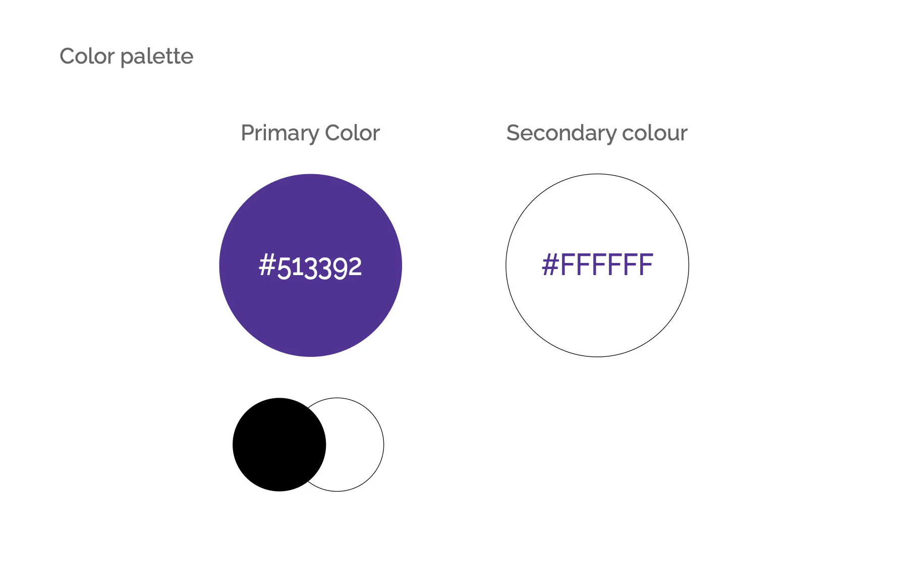
The palette, straight from the book
Click or tap a colour to copy its hex.
Type
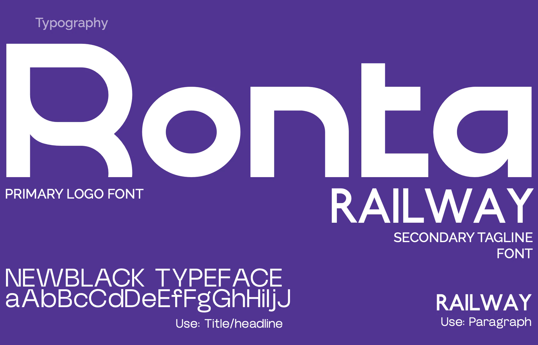
Three faces, one voice
Ronta
The primary logo font.
NewBlack
Titles and headlines.
Raleway
Our goal is to guide every student towards success.
The EDUCATION tagline and paragraph text.
Set live in Raleway, as the book specifies.
System
Everything around the logo
- Flat, confident fields of Clarix Purple and white. No gradients, textures or patterns.
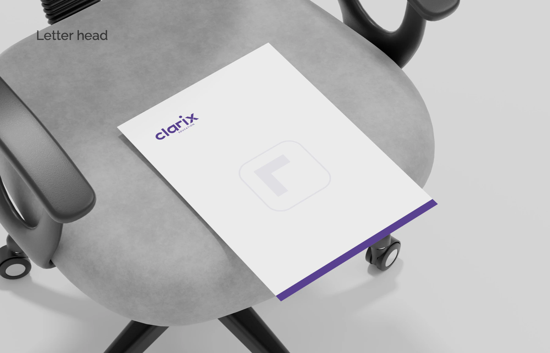
- The stepped-r icon in its rounded frame, as a stand-alone mark and as a ghosted watermark on the letterhead.
- A mascot family: a flat-illustrated student guide in a purple overshirt, shown pointing, sitting and gesturing.
3 more from the bookShow less
- The line "Guiding Students With Clarity".
- No photography system: applications are shown as clean presentation mockups on neutral grey.
- Voice: plain, reassuring, supportive. "We simplify the process, help compare options, and ensure students make confident decisions about their future."
Applications
The brand at work
Presentation mockups from the brand identity, not photos of produced pieces. Open any page to flip through the book.
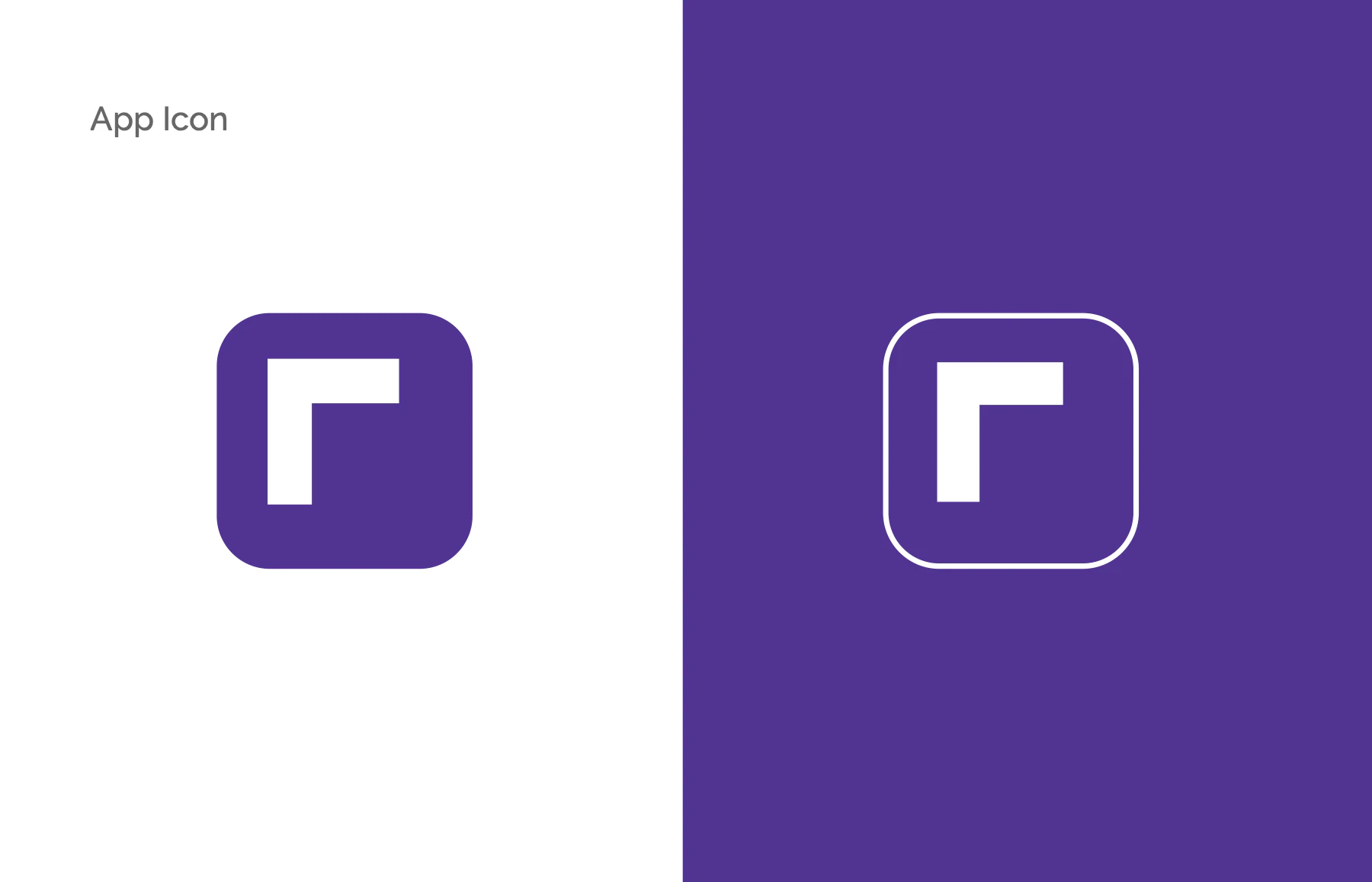
The app icon as a solid purple tile and as a white outline on purple. 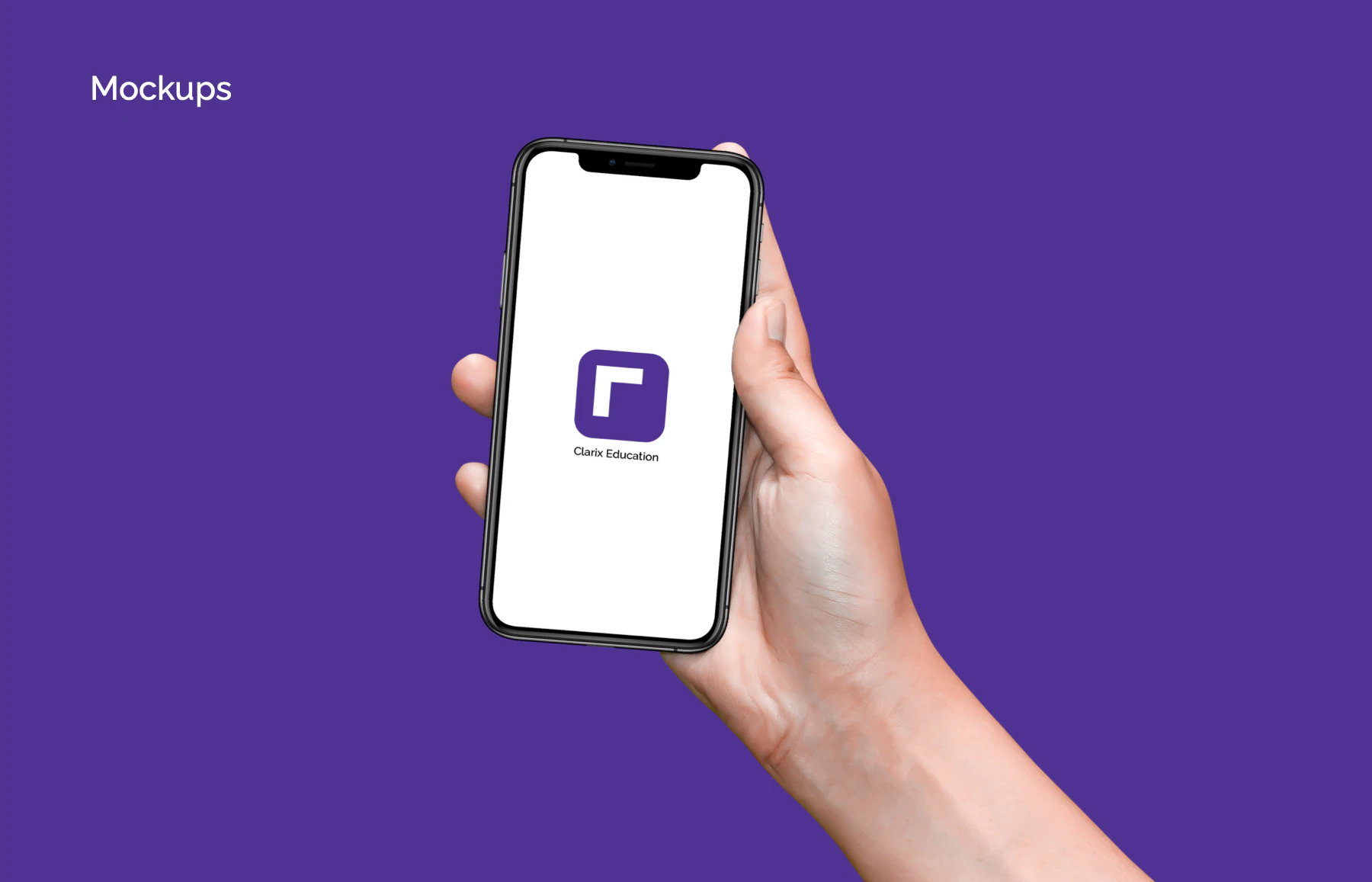
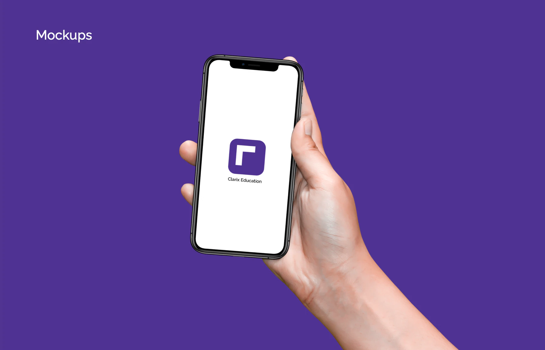
Mockup: the icon at home-screen size on a phone. 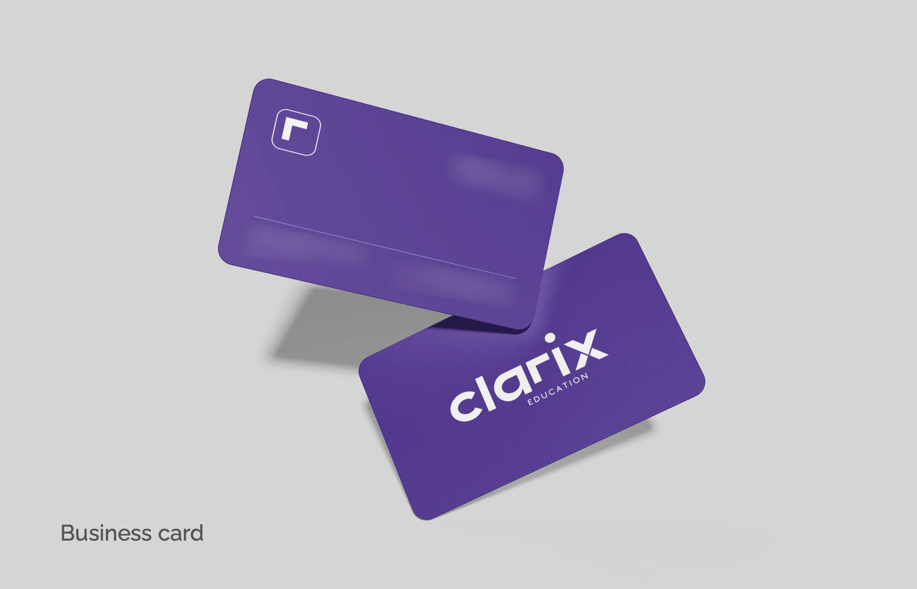
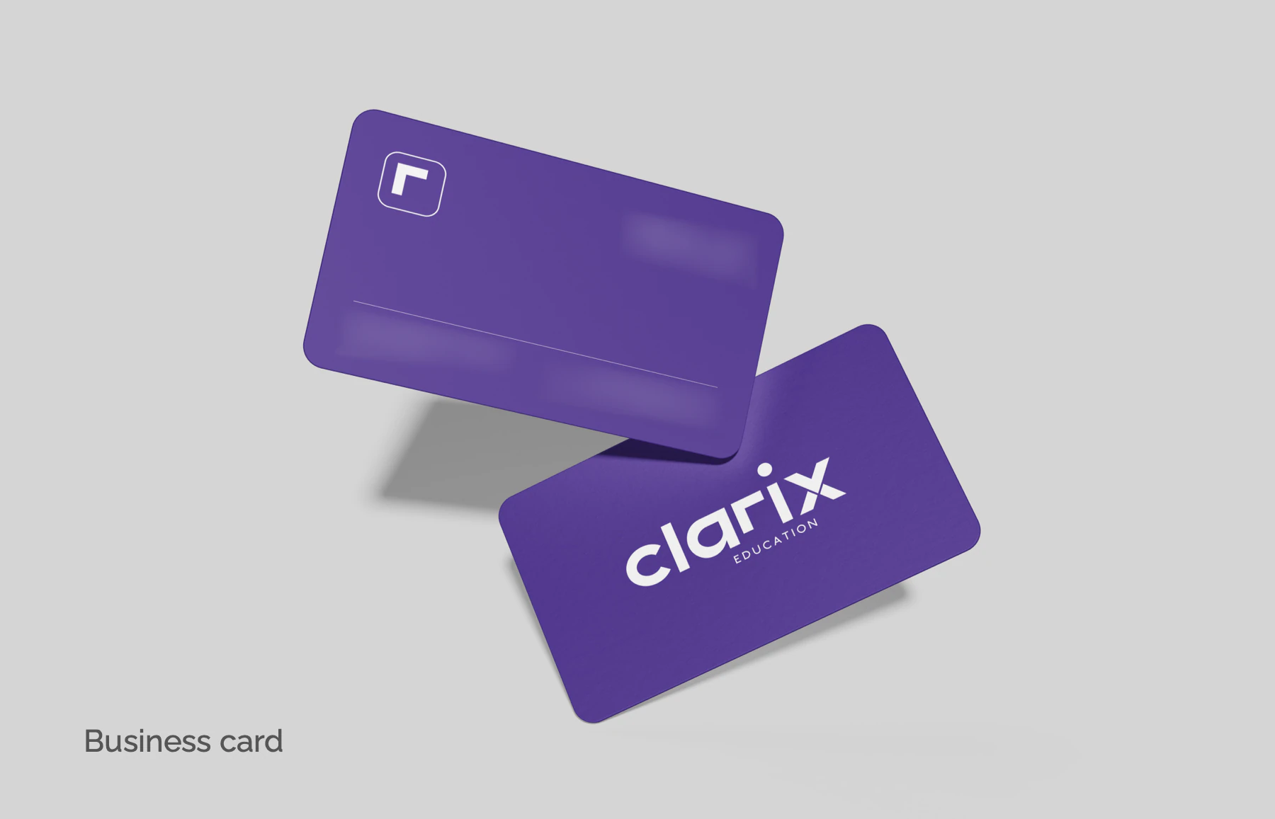
Mockup: double-sided business cards, with the icon and contact face and a wordmark reverse. 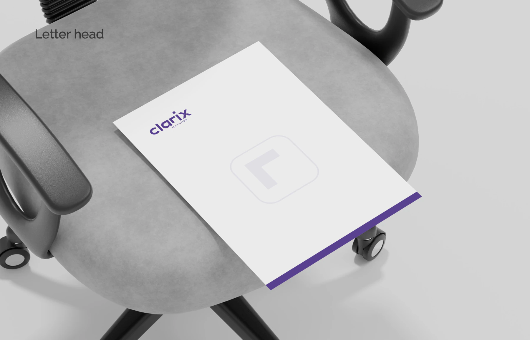
Mockup: letterhead with the wordmark top left, a ghosted icon watermark and a purple foot band. 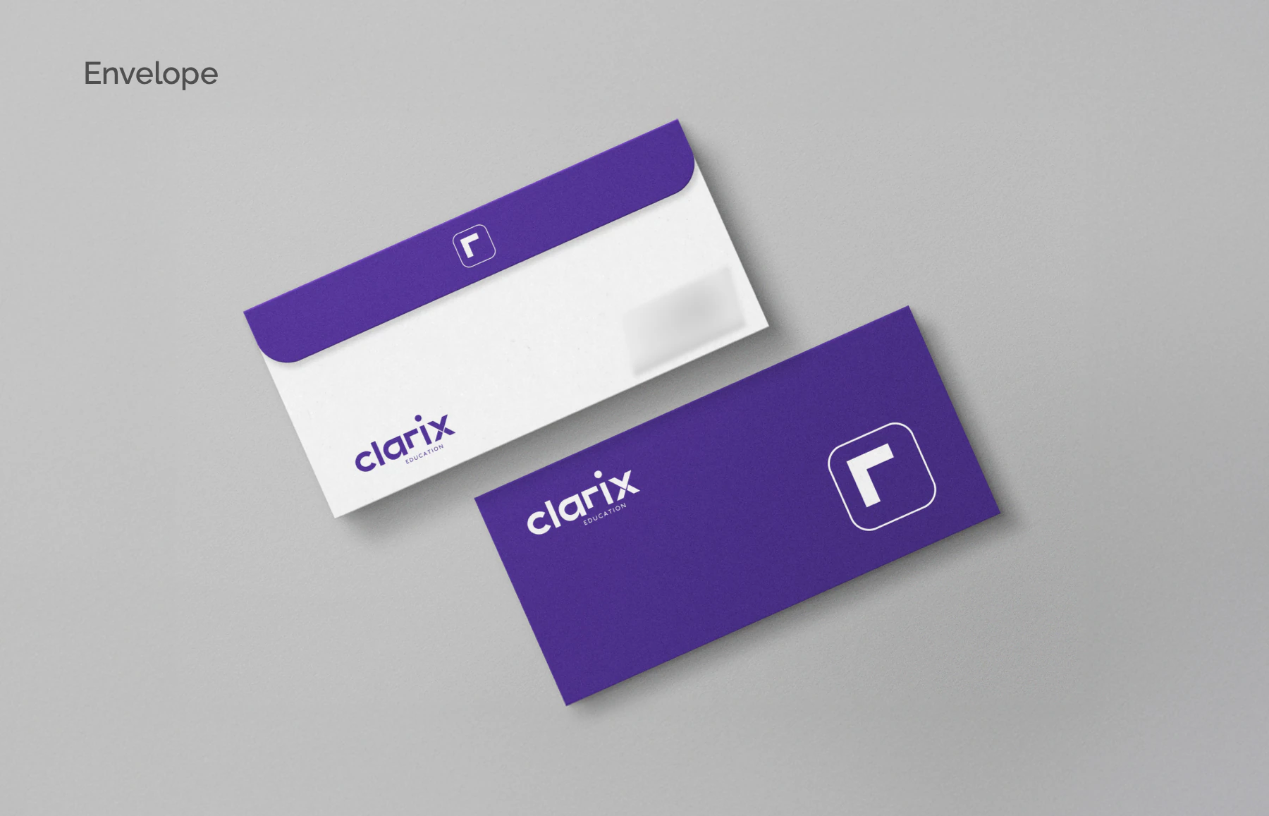
Mockup: DL envelopes, a purple flap carrying the icon and an all-purple reverse.
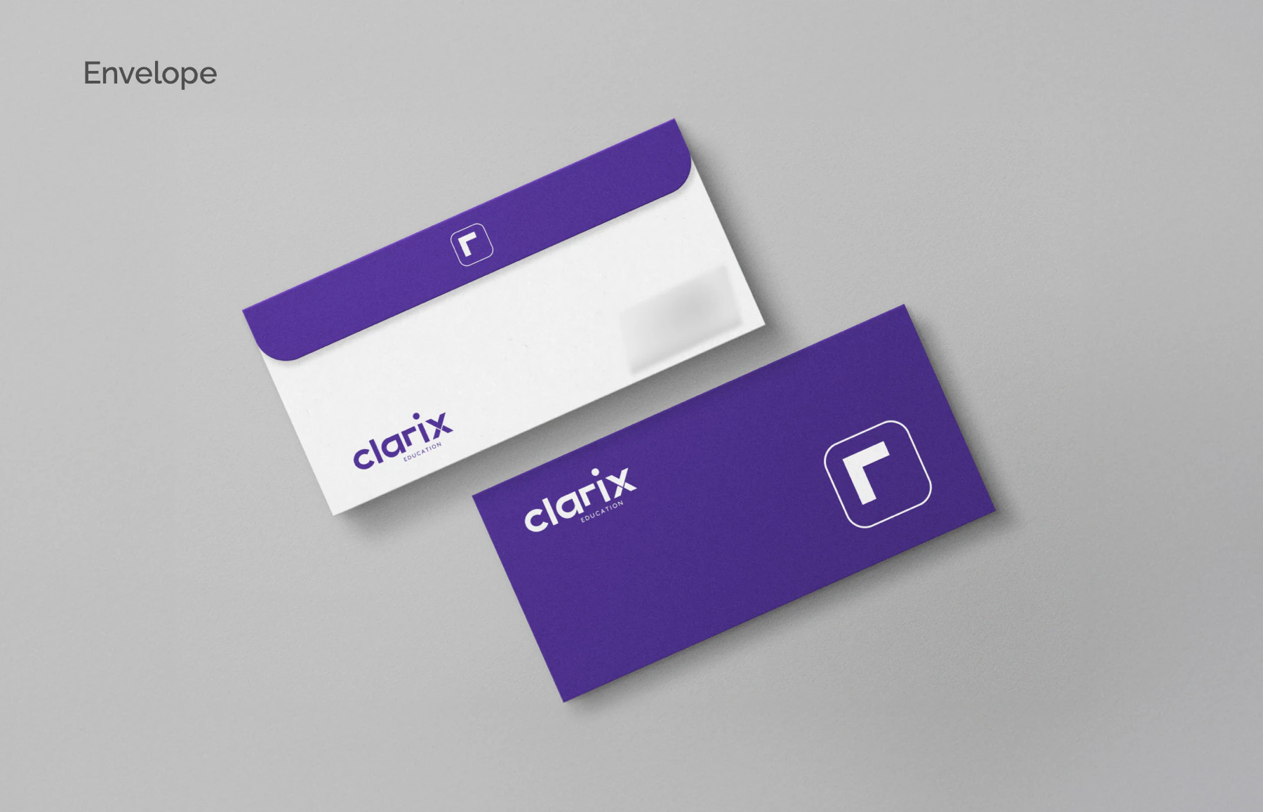
Across the book: App icon · Phone home-screen mockup · Double-sided business cards · Letterhead · DL envelopes.
Credits
- Services on this brand
- Branding
- Sector
- Education consultancy
- Location
- Kochi and Calicut, Kerala
- The same brand at work: the marketing, website, videos and SEO we did for Clarix.
- Clarix Education case study

Your brand next
Want a brand that works this hard?
Tell us what you sell and who has to trust it. We'll come back with the direction, the system and every place it has to work, from the sign to the social feed.
Every rupee you spend with us has to earn its keep.