Brand guidelinesNature & heritage resortWayanad, Kerala
YnadResort brand identity, Wayanad
An identity for a Wayanad hill resort, built from six interlocking Ys in forest green, mist grey and sunset orange.
- Kind
- Brand guidelines
- Sector
- Nature & heritage resort
- Location
- Wayanad, Kerala
The brief
What Ynad needed
Ynad Mount Resort is a resort in the hills and forests of Wayanad. It presents itself as "a harmonious blend of modern luxury and tribal traditions", a place where guests "become a part of Wayanad's timeless journey".
Read moreShow less
The identity had to hold three things together: a landscape of dense forest, rolling hills and mist; the region's tribal heritage, from the Edakkal cave carvings to Warli art; and a calm, premium stay. It also had to run across the whole guest journey, from stationery and signage to in-room amenities and the restaurant.
The idea
Lost in the Mist.
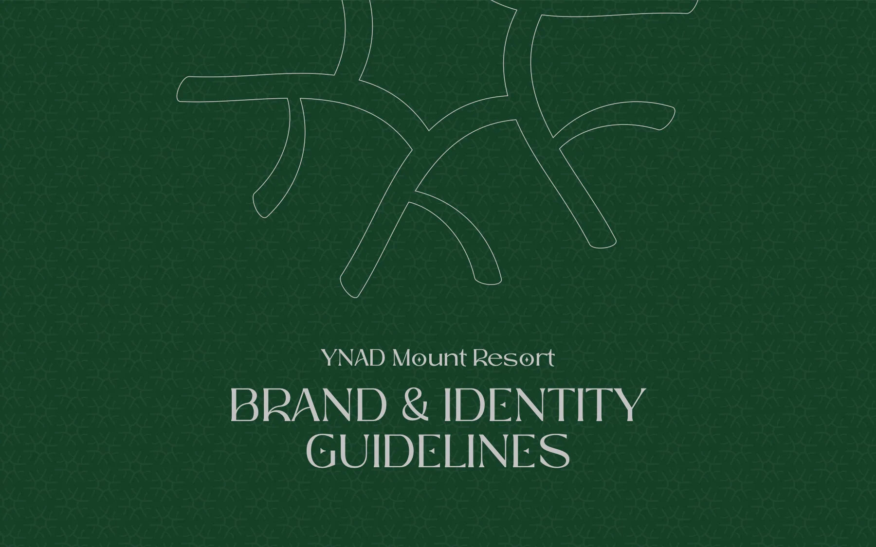
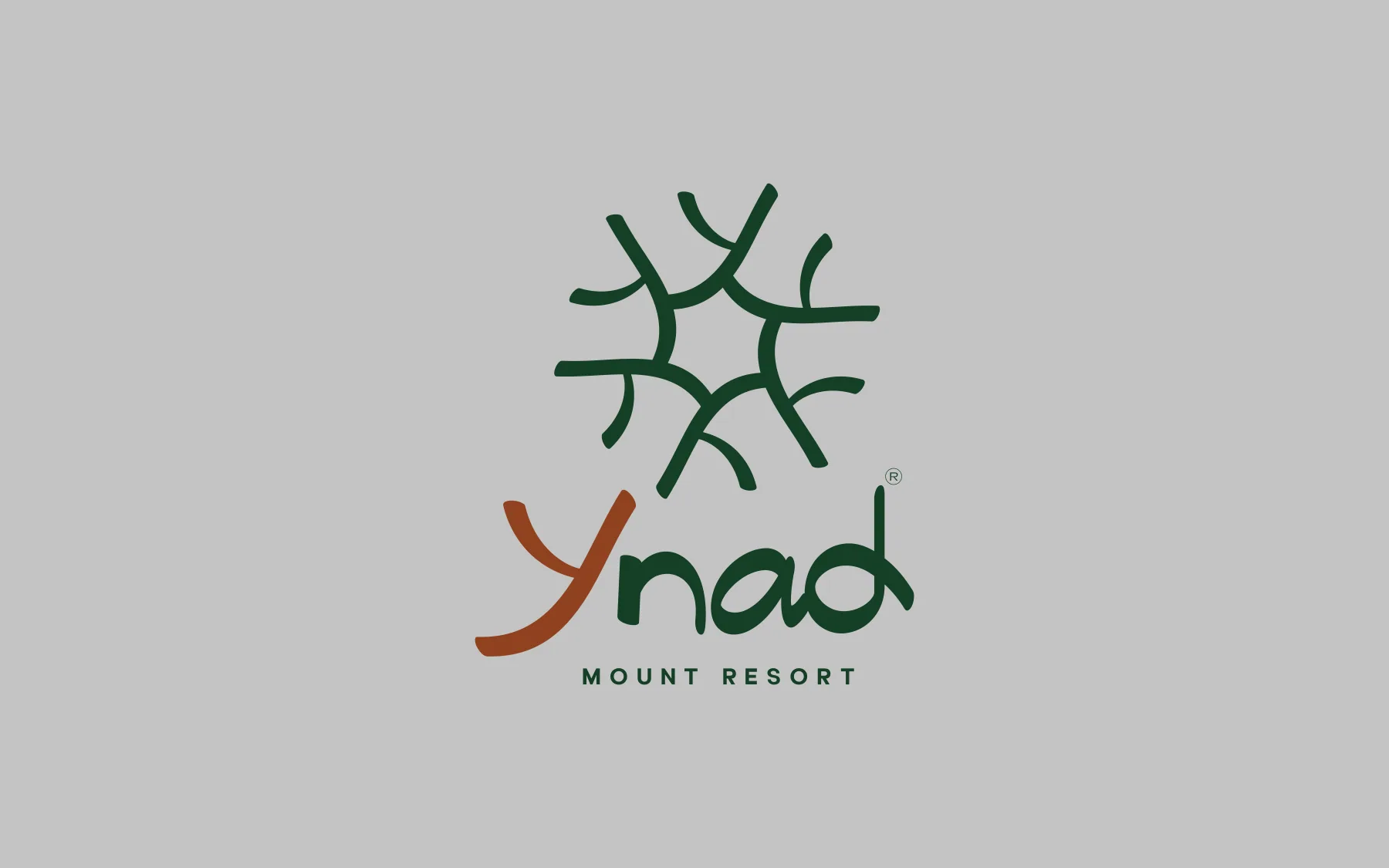
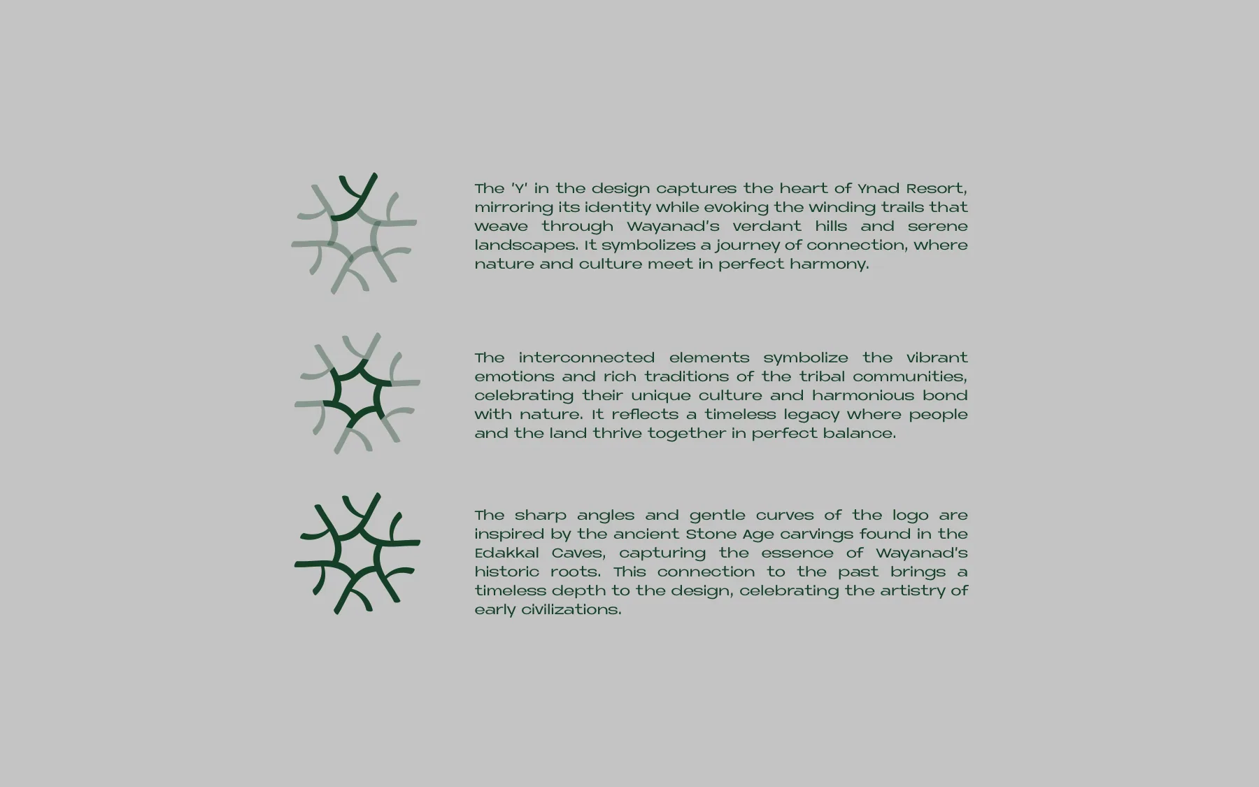
The identity grows from the Y in Ynad. Six Y strokes interlock around a hexagonal centre into a radial mark that reads as forest branches, as winding trails through the hills and as a ring of people holding hands: connection between people and land.
Read moreShow less
The strokes mix sharp angles with gentle curves, after the Stone Age carvings in the Edakkal Caves, so the mark feels hand-cut and old rather than corporate. The palette is Wayanad's day: Forest Green for the forest, Silver Gray for the mist, Burnt Orange for sunset and Sand Dollar for the light at dusk.
Logo
The mark
Six interlocking Y forms around a hexagonal centre, with a hand-drawn lowercase "ynad" (its Y in Burnt Orange) and MOUNT RESORT in wide-tracked geometric capitals. The construction page builds it in three layers: the Y, the ring of connected forms, and the angle-and-curve strokes of the Edakkal carvings.
Read moreShow less
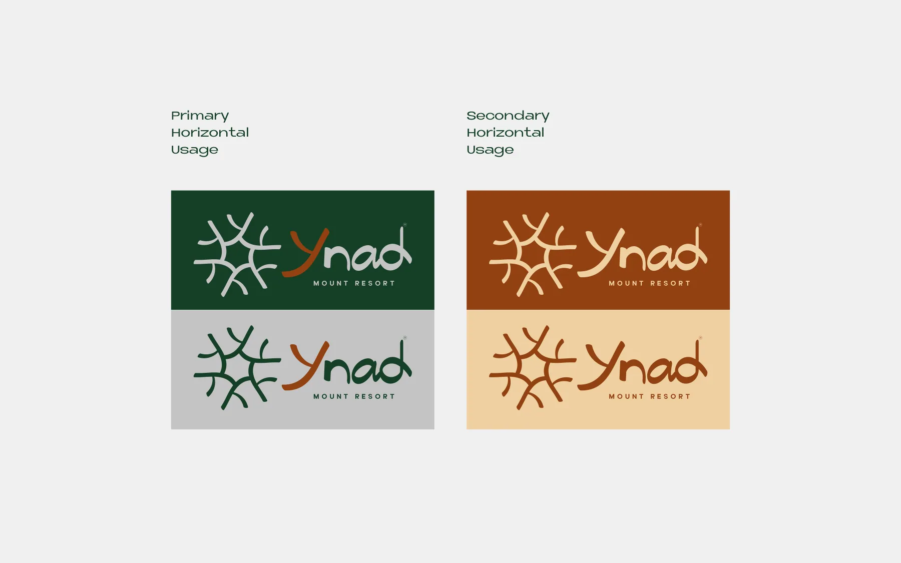
Variants cover a stacked primary lockup, green-and-silver primary colourways, burnt-orange-and-sand secondaries, horizontal lockups, one-colour versions and a circular seal for embossing and stamping. Clear space is set for each, with minimum sizes of 125 px stacked and 200 px horizontal.
Colour
The palette, straight from the book
The book sets the split: 45% Forest Green, 30% Silver Gray, 20% Burnt Orange, 5% Sand Dollar. Click or tap a colour to copy its hex.
45% Forest Green30% Silver Gray20% Burnt Orange5% Sand Dollar
Type
Two families, one voice
Leotaro Regular
Primary: titles and main headings. A high-contrast display serif with diamond-shaped counters.
Neue Metana
Secondary: headings, sub-headings and paragraphs. A wide geometric sans in Regular and Bold.

System
Everything around the logo
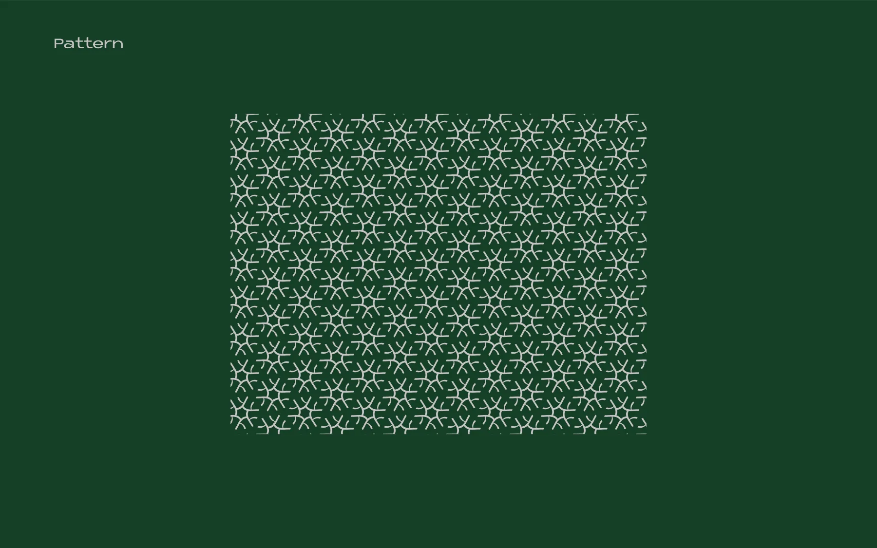
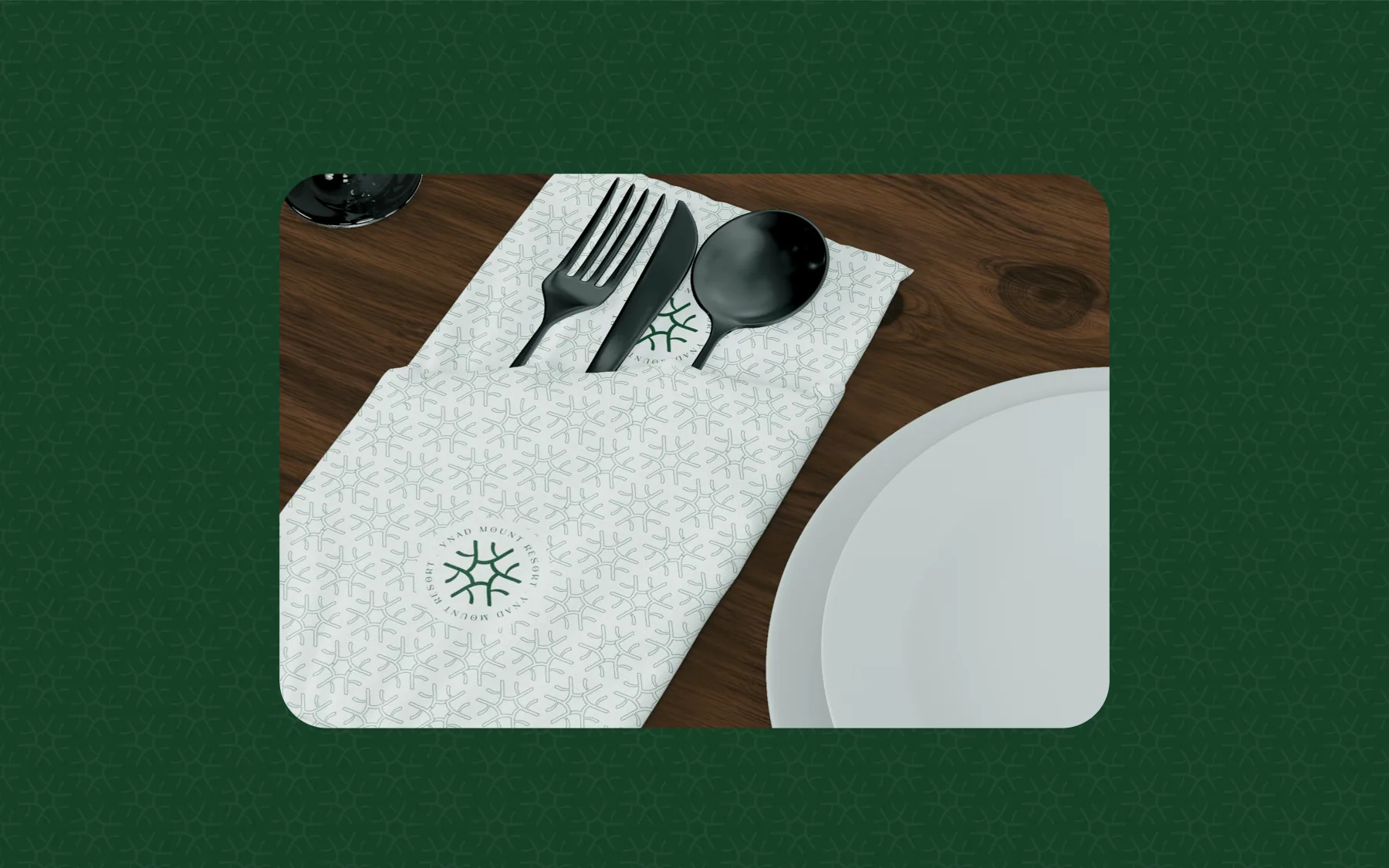
- A pattern: the logomark tessellated into a continuous lattice, silver on green, tone on tone behind green pages, and green on white napkins.
- A super-graphic: the logomark oversized and cropped, in outline or solid, on the cover, section dividers, cards, flags, key tags and the tote.
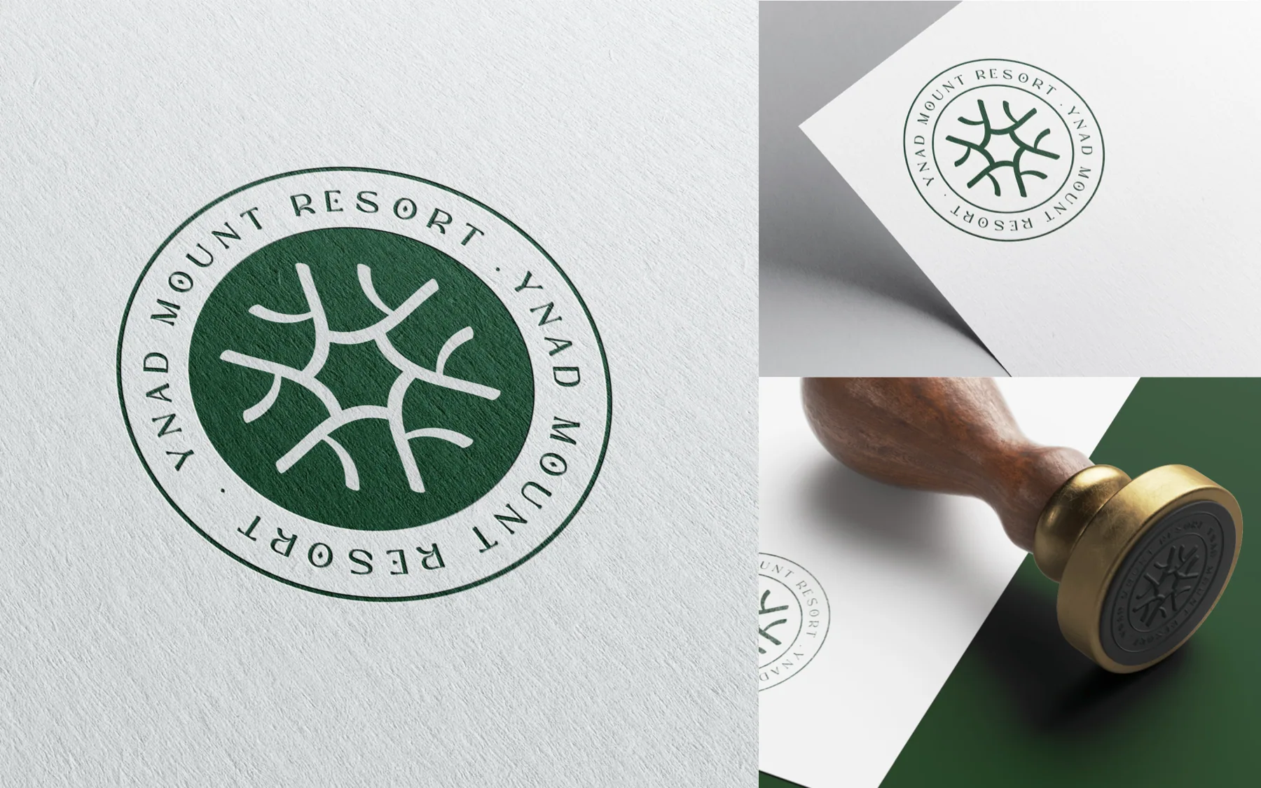
- A circular seal with YNAD MOUNT RESORT set around the mark, for embossing, stamps, door hangers and napkins.
4 more from the bookShow less
- Flat colour blocking in green, burnt orange and sand, with orange bars bracketing photographs.
- A thin-line icon set (stairs, lift, no smoking, restrooms, restaurant, pool) for wayfinding.
- Photography direction: misty Western Ghats rainforest, hills at sunrise, green-toned rooms. In the book these are mood references, not the property.
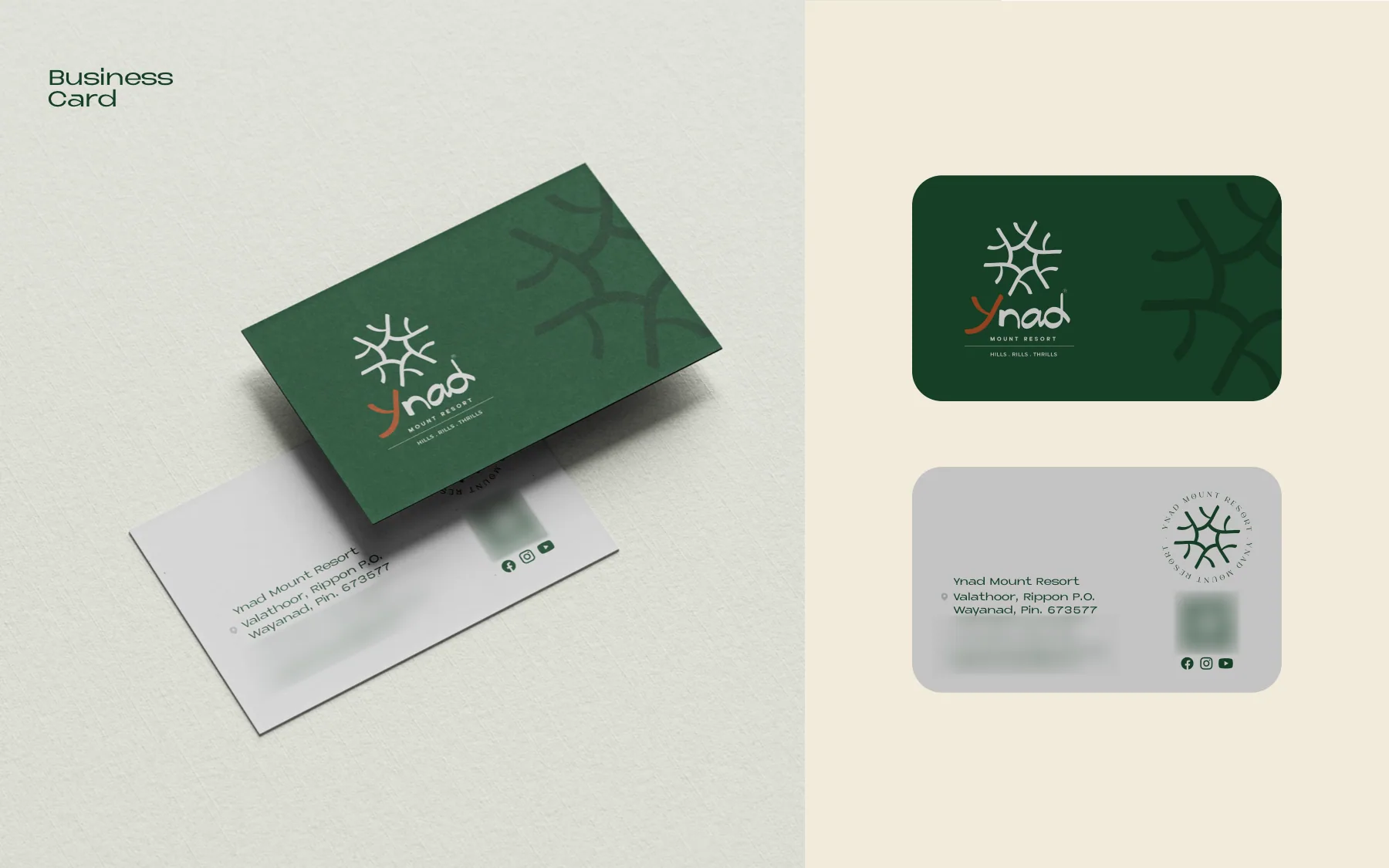
- Voice: calm, sensory, place-proud. "Lost in the Mist." "The art of Escape." "Your sanctuary awaits." On the business card: "Hills . Rills . Thrills".
Applications
The brand at work
Presentation mockups from the brand guidelines, not photos of produced pieces. Open any page to flip through the book.
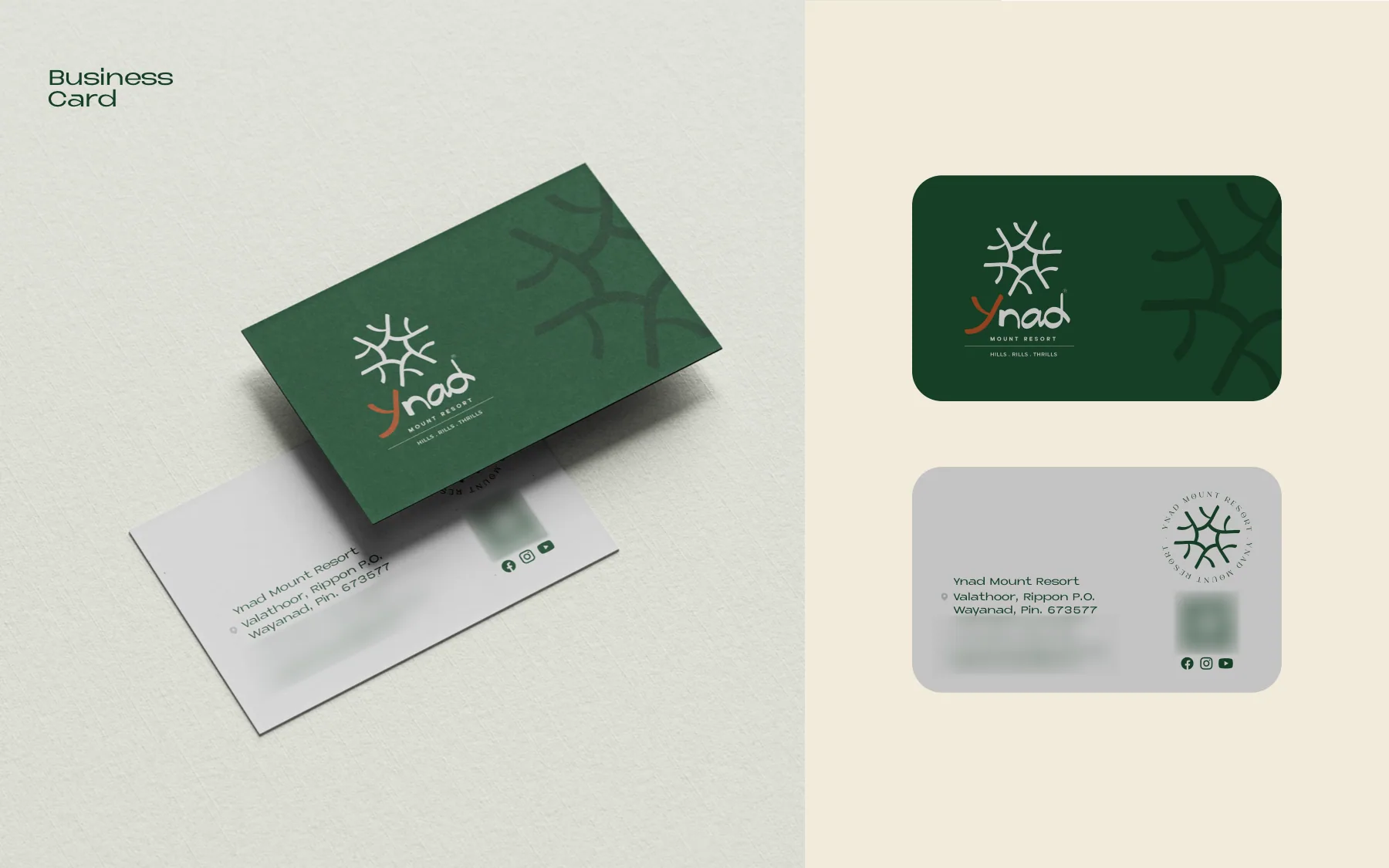
Business card mockup with the line "Hills . Rills . Thrills". 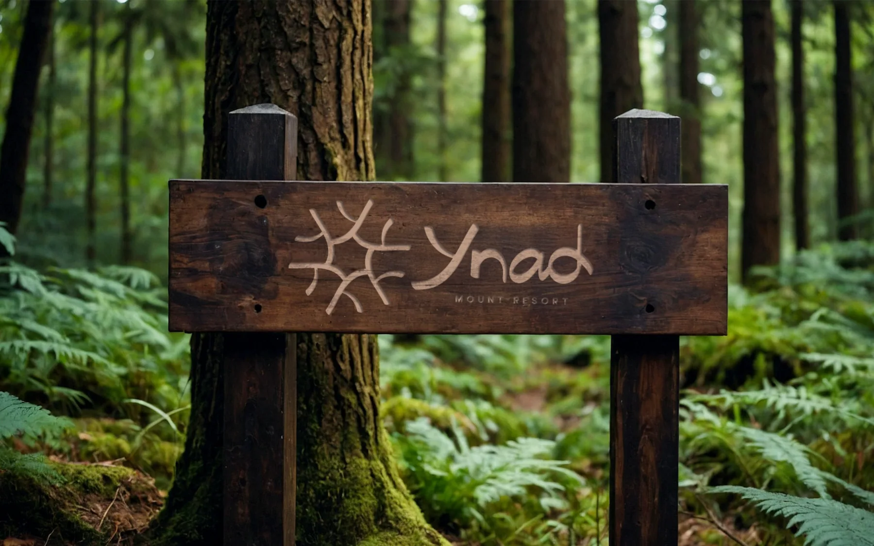
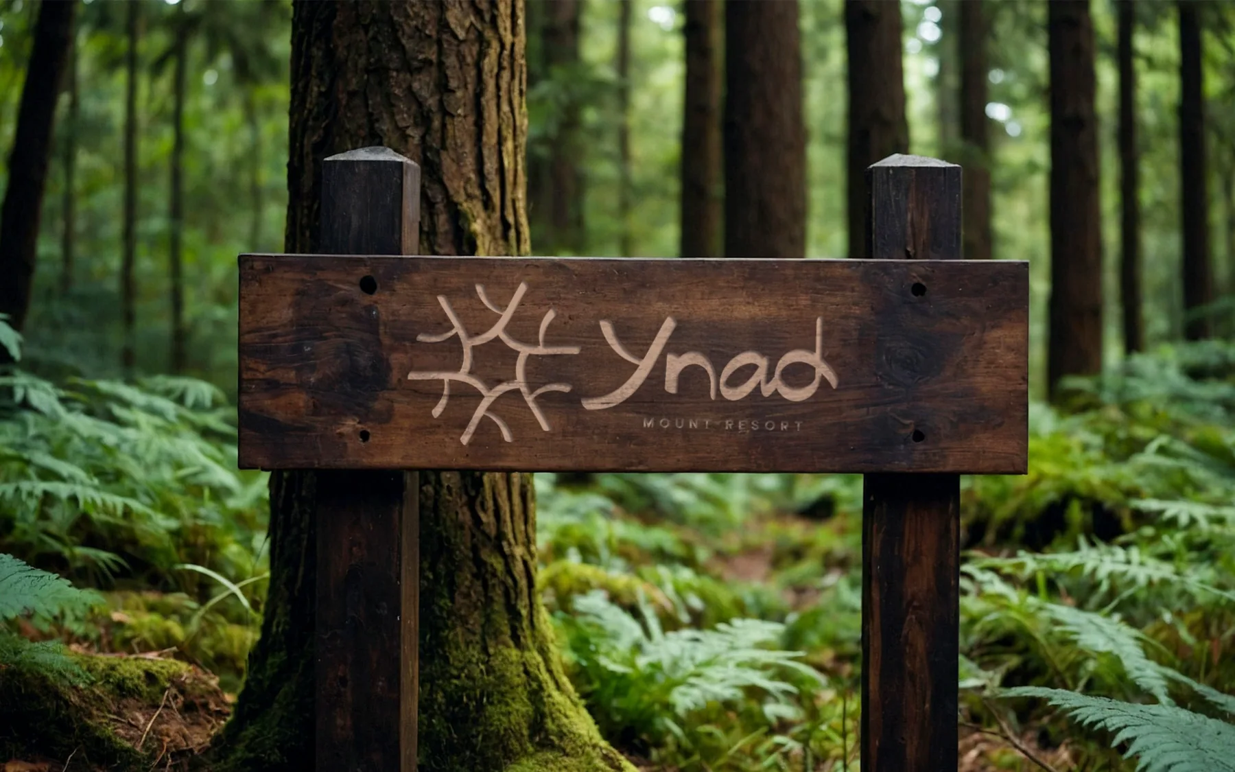
The horizontal lockup routed into a timber sign on a forest trail (mockup). 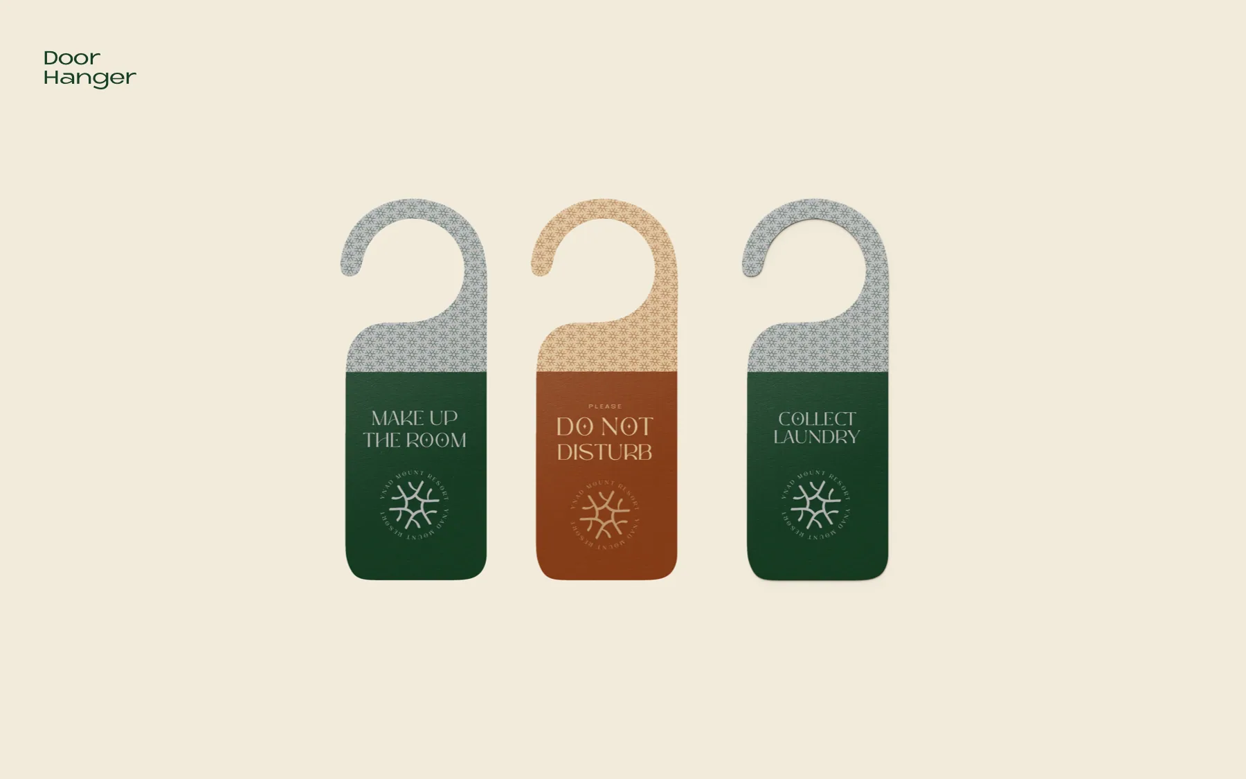
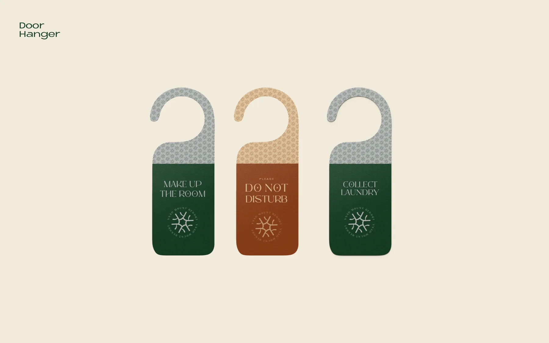
Door hangers in green and burnt orange, topped with the pattern and closed with the seal. 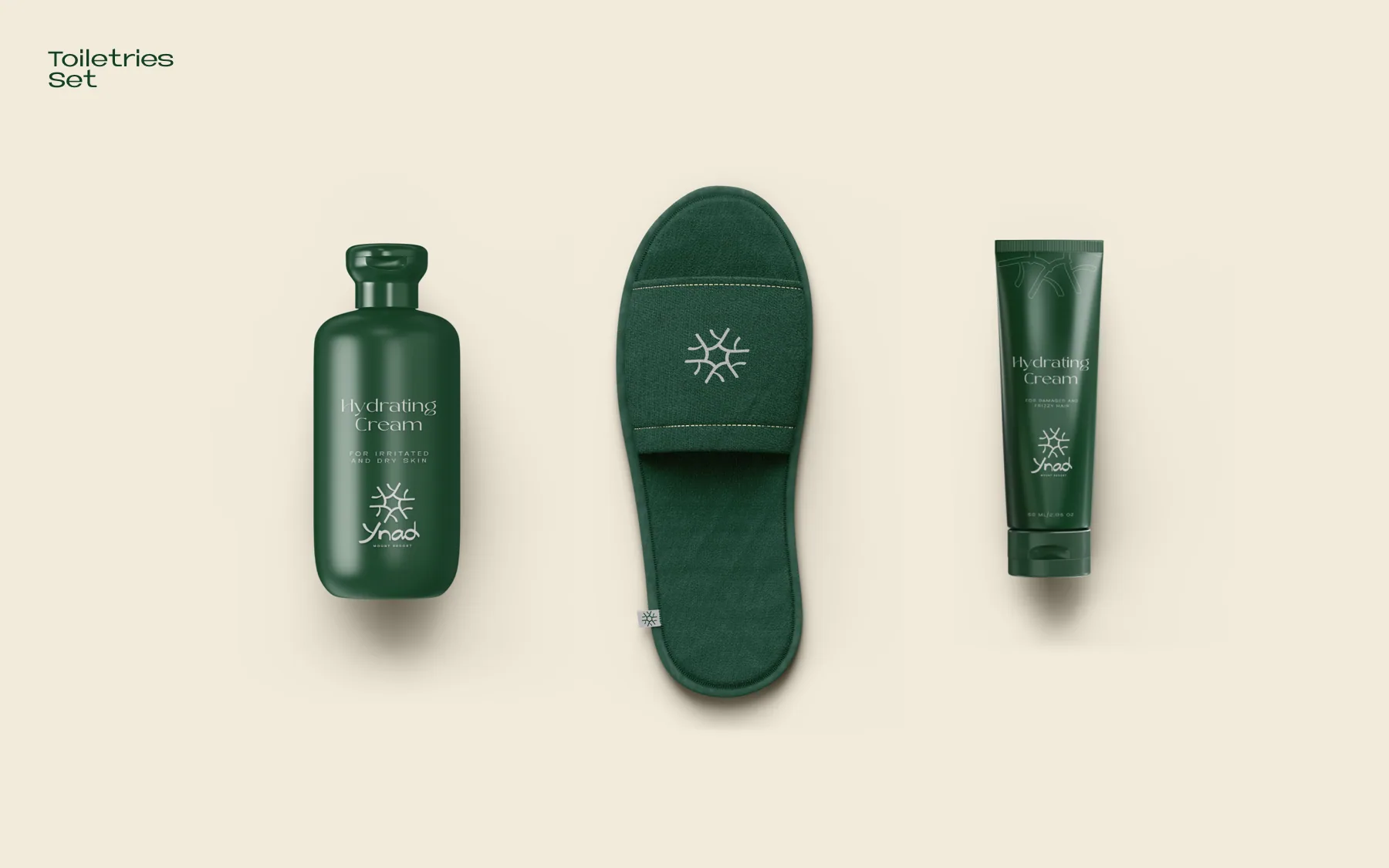
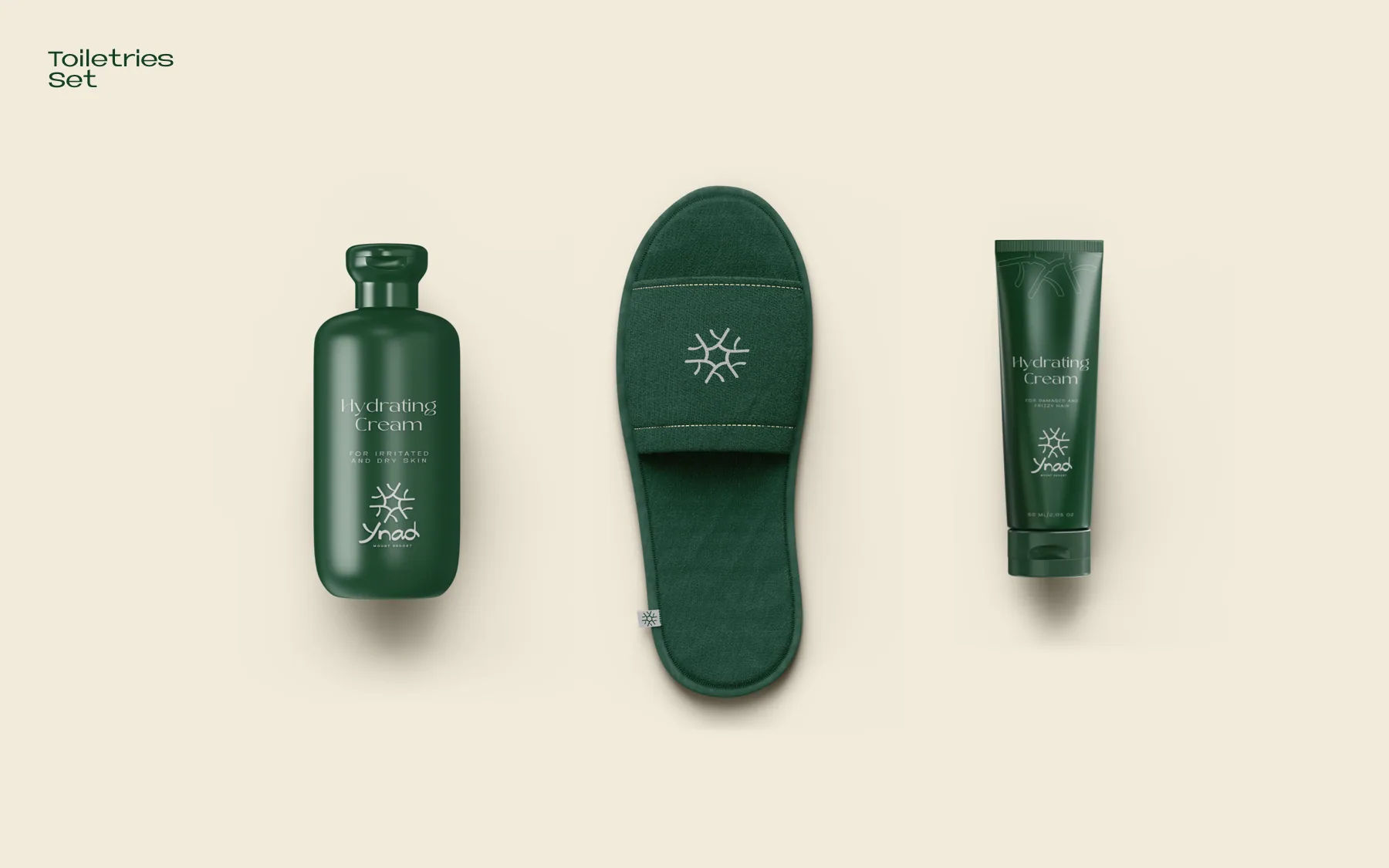
Guest amenities: hydrating cream, a slipper with the embroidered mark, and a tube. 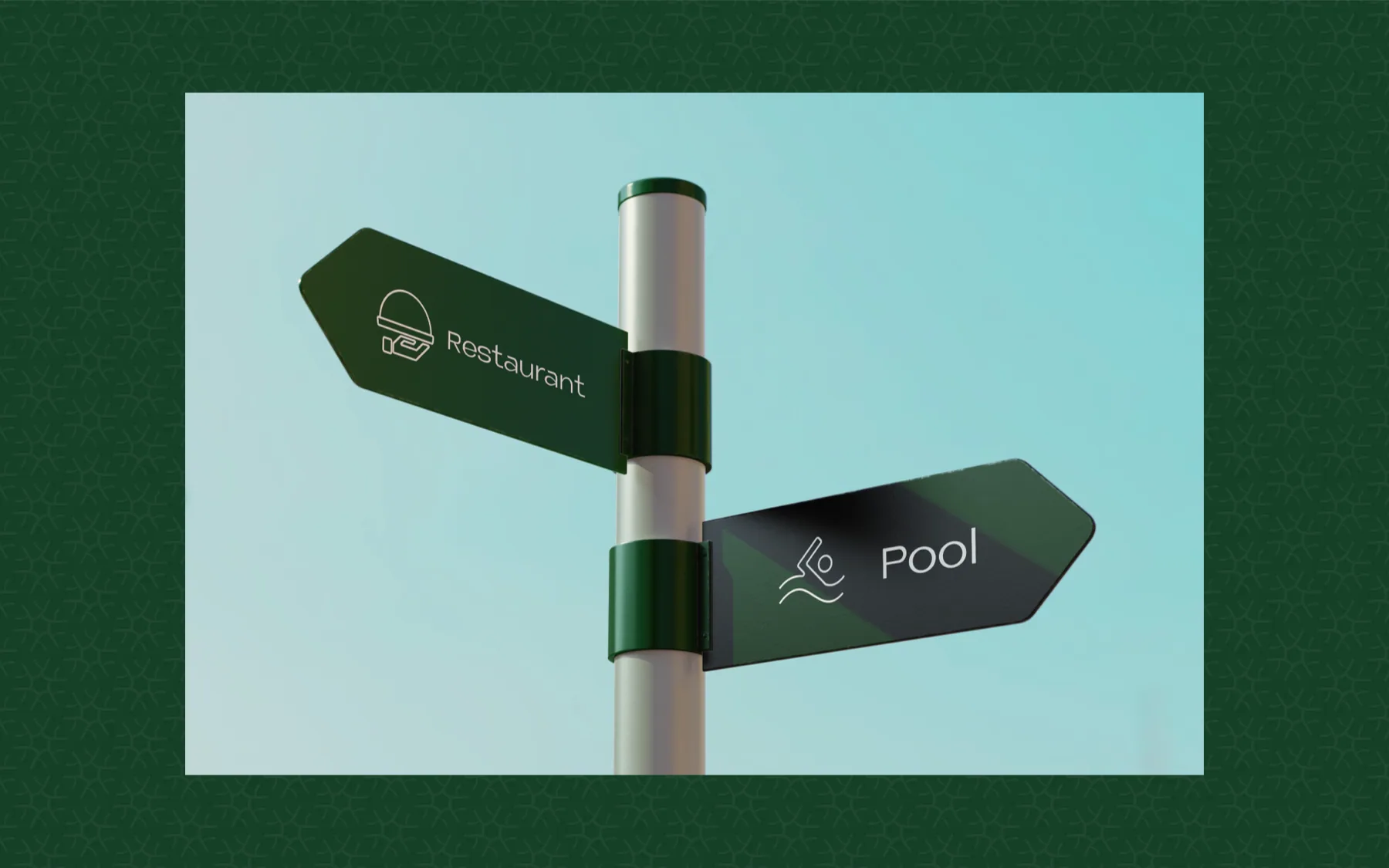
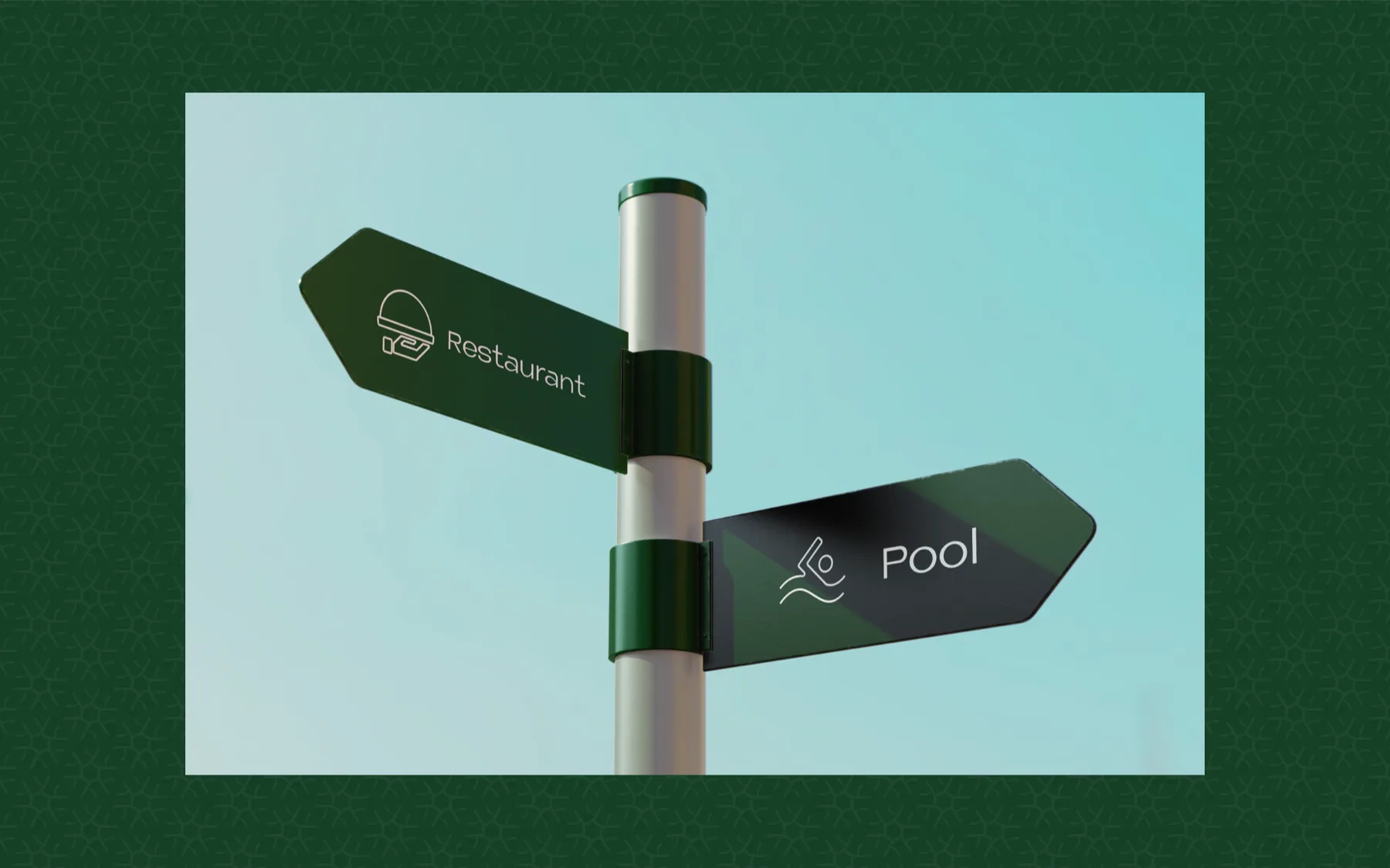
Wayfinding: finger-posts with the thin-line icon set. 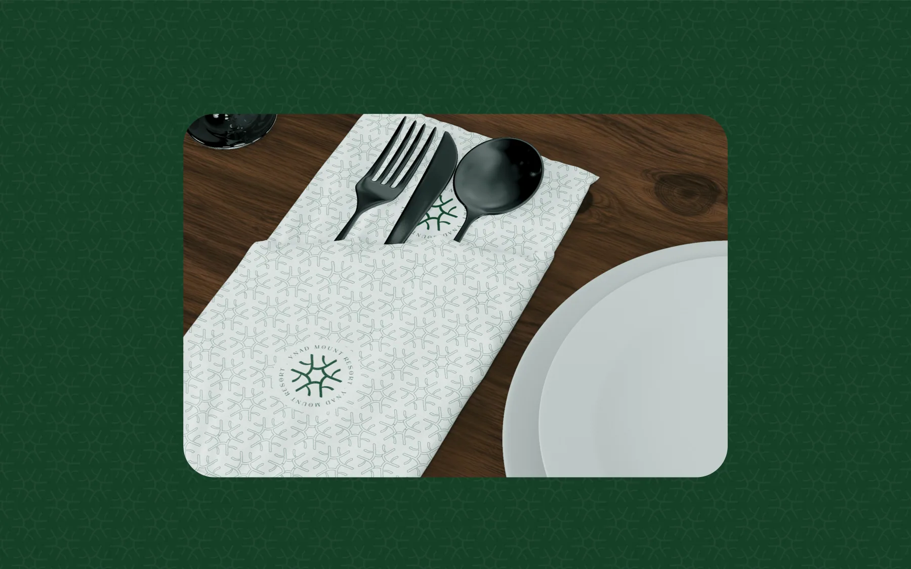
A restaurant napkin printed with the pattern and seal.
Across the book: Business card · Envelope and letterhead · Timber entrance sign · Door hangers · Toiletries set · Candle · Billboards and flags · Flyer and brochure · Tote bag · Key tags and bed linen · Wayfinding finger-posts · Blade sign and window vinyl · Staff apron and placemats · Restaurant napkins.
Credits
- Services on this brand
- BrandingPackaging Design
- Sector
- Nature & heritage resort
- Location
- Wayanad, Kerala

Your brand next
Want a brand that works this hard?
Tell us what you sell and who has to trust it. We'll come back with the direction, the system and every place it has to work, from the sign to the social feed.
Every rupee you spend with us has to earn its keep.